New Site Theme: Fear Protocol!
I made a new theme for the site today, and it now replaces "2006 The Reloaded" as the default appearance for the site. Which means, if you haven't explicitly chosen a visual scheme for this site, it should be looking quite different from when you last saw it! I call the new theme "Fear Protocol" and it uses drawings of mine as the logo and other graphic elements of the page design. This may not be as polished or elegant as the earlier design, but I'm going to retain it as it's way more interesting than the old one was. Also, I'm going to enjoy freaking out first time visitors to the site with this.
Of course, you can switch the appearance back to the old theme anytime you want, simply by going to the Customise link and selecting "2006 The Reloaded" as the theme. To view the new theme, select "Fear Protocol" from that page. If you haven't done it already, you might also want to check out the other two themes available.
With that out of the way, here is some "behind the scenes" stuff on this new design. First of all, I must credit IronicSans, as it was that site which inspired me to use drawn graphics as opposed to fonts for the logo and other elements. The logo banner, menu items and the icons for post categories were simply drawn out on one sheet of paper, scanned and then used for the graphics. I decided to use black, white, grey and red as the primary colours in this design, and so the drawings were done with black ballpoint pen, pencil and a red gel pen. With the exception of the "creepy guy" face at the extreme right of the logo header, all art was created newly for this design. Here is a combined image of the "Post Category" icons —
You can click on that to see a large image. A short description of each of the icons follows —
- Movies: Represented by a close-up of the Billy puppet from the Saw movies.
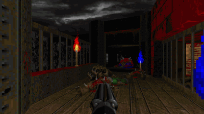
- Doom: One more extreme close-up, and this one is of the Spider Mastermind from the game.
- General: I was thinking about what to draw for this. Finally, I went with a movie character again, this is Brad Pitt as "Tyler Durden" from Fight Club. Apart from the fact that the movie is one of my all-time favourites, I used this picture as it contains nice red elements that go well with the overall scheme. This is based on a painting by Phil Noto.
- Art: The idea here was to have a drawing that was partially completed. I don't know whether the final icon conveys that effectively enough, but anyway it suffices I guess. The face here is Trent Reznor, frontman of the band Nine Inch Nails.
- Tech: This is not an often-used category for my posts, and it is also one of the tougher ones to choose an image for. I use this category to classify the more technically-inclined posts, so the image I used is one of the "Reverse Beartrap" from Saw. After all, it is a product of Engineering!
The notebook lines which are used as the page background were scanned off an actual notebook (a TCS notebook, one we got at work sometime back). The blue shading between some of the lines were actually at the bottom of the notebook page, I reversed that for the site, as having the blue on the top seemed to go better with the banner placement. Another interesting element is the Nasty Little Thing mascot peeking from the left of the logo! For the typeface I decided to go with normal Arial, falling back to Helvetica and then default sans-serif. This design is also wider than the previous ones, to accomodate the larger font size. So, a 1024 × 768 resolution is required for this, anything lower and you'll get scrollbars. I used to stick to designing for lower resolutions also, but I don't think those are that prevalent any more (last time I checked, under 4% of my visitors were using 800 × 600).

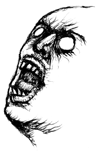
With all the other elements of this new design broken down, the only one left to talk about is the "Creepy Face" which you see above, and on the header to the right of the logo. You could actually call this one a doodle. It was done on 13 Jun 07. You see, it was Campus Recruitment season at TCS Chennai, and I had gone to support that at Coimbatore (we visited several colleges there, and the recruitment numbers were huge!). Anyway I was on one of the interviewing panels and I was keeping a list of the students we were interviewing (just to keep track of how many interviews our panel was doing). I drew that creepy face on that paper, in between interviews. I later showed it to my roommate Rajith, who was sufficiently creeped out by it.
Whoa, that turned into a long post! Well, do let me know what you think of this new design of mine. Like I said, until something better comes along, I am going to keep this as the default appearance of the site, as it is more "personal" than the standard stuff I've been doing all this while.
Comments for this News Post

Billy Billy my fav toy..V gen lik horror n gore..same club :D
site luks very nice..'handmade' is th name iv given ... nice na
with a backlink in the desciption?
Greets Corvi
PS awesome skull^^
Please reply back as I'm wanting to create my very own site
and would love to find out where you got this from or exactly what the theme is
named. Thanks!
articles? I mean, what you say is fundamental and all. Nevertheless just imagine if you added some great photos or videos to give your posts more,
"pop"! Your content is excellent but with images and video clips, this site could undeniably be one of the very best in its field.
Great blog!
any trouble with hackers? My last blog (wordpress)
was hacked and I ended up losing a few months of hard work due to no data backup.
Do you have any solutions to protect against hackers?
subscription link or e-newsletter service. Do you have
any? Kindly allow me recognise so that I may subscribe.
Thanks.
I really hope to check out the same high-grade content by you in the future as well.
In truth, your creative writing abilities has encouraged me
to get my own, personal blog now ;)
) I may revisit once again since I bookmarked it. Money and freedom is
the greatest way to change, may you be rich and continue to help other people.
information for me. And i'm glad reading your article.
But should remark on few general things, The website style is perfect, the articles is really great : D.
Good job, cheers
acknowledging addiction as a disease.


Dark Fate 2 is a singleplayer level for Doom II, replacing MAP01. It's a small-sized hellish level — and there's a walkthrough video as well.


27-year old Taurean (birthday 15-May-82), Assistant Manager - HR at Tata Consultancy Services Ltd in Hyderabad, India. Previously, did Post Graduate Diploma in Management from T A Pai Management Institute (2003-05) and before that, Computer Science Engineering from Sree Nidhi Institute of Science and Technology (1999-2003).
Email: karthik82 -AT- gmail -DOT- com
orkut profile
Facebook profile
YouTube channel
deviantART page
Google Reader Shared Items
Disclaimer: The views expressed on this site are purely my own.
Warning: This site occasionally contains profanity.
![[ Karthik82.com Logo ]](/design/5/logo.png)

