Introducing the new Karthik82.com design!
I spent the last couple of weekends working on a redesign for this site. After quite a few hours of work, it is now done, and the new design is live! You should be looking at it now, and as a reminder, here's what the old design looked like —
When the time came for me to re-upload the website after switching to a new host, I was actually thinking of shifting the blog to Wordpress, which the host allows me to set up automatically. But then, there was no easy way to migrate all my old posts (more than 400) and comments (nearly 300) to Wordpress, and hence I decided to continue using my own custom-coded system. Still, this was an opportunity to do a redesign, and I decided to reorganise the content a little too. Comparing the old design and the current one, you'll see that the focus has shifted to the blog, and I've got rid of some infrequently accessed items off the main page. The current design is actually based on Derek Punsalan's Grid Focus Wordpress theme. I'm not actually using that theme (because obviously, that is designed for a Wordpress blog), my design is built from scratch, but I followed the Grid Focus theme quite closely. Dimensionally, I was inspired by the 960 Grid System.
As for the reorganisation of content, I haven't actually deleted anything — if there's anything you're looking for and it's not on the main page, it has been moved to the Archives page. So what do you think of the new look?
Comments for this News Post


I'll boot Ubuntu from CD also and check it out.
Regarding reorganizing the site, if you are on Apache, it takes a bit of fiddling around with .htaccess files, but it avoids a lot of 404s :)


Arun -- Even though I did a reorganisation of the content, the page URLs haven't changed, so no need for fiddling with .htaccess files :)
Haven't yet checked the site out with Ubuntu... I thought of waiting for a couple of days more for Ubuntu 8.10 Intrepid Ibex to come out! Will download that and then have a look at it.


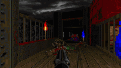
Dark Fate 2 is a singleplayer level for Doom II, replacing MAP01. It's a small-sized hellish level — and there's a walkthrough video as well.


27-year old Taurean (birthday 15-May-82), Assistant Manager - HR at Tata Consultancy Services Ltd in Hyderabad, India. Previously, did Post Graduate Diploma in Management from T A Pai Management Institute (2003-05) and before that, Computer Science Engineering from Sree Nidhi Institute of Science and Technology (1999-2003).
Email: karthik82 -AT- gmail -DOT- com
orkut profile
Facebook profile
YouTube channel
deviantART page
Google Reader Shared Items
Disclaimer: The views expressed on this site are purely my own.
Warning: This site occasionally contains profanity.
![[ Karthik82.com Logo ]](/design/5/logo.png)


