Lost — Mysteries of the Island
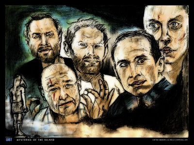
The final season of Lost started on 2-Feb-10, and I have been watching episodes of the show as and when they come out. However, shortly before this season started, I did this drawing called "Mysteries of the Island". Here it is, below —
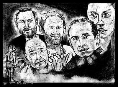
This drawing was done very quickly with a pencil and then coloured in Photoshop. For those of you who watch Lost, you'll know the significance of the characters represented in this drawing — they are all characters in the show who have a deeper "connection" with the mysterious island. There's Jacob and his Nemesis, there's John Locke holding up black and white backgammon pieces (which could have a connection with Jacob and the man in black, his enemy), Benjamin Linus, Richard Alpert (who never grows old), the Smoke Monster, and the Taweret statue. A lot of questions have been raised by the creators of the show over the past five seasons. Let's hope they wrap up everything in Season Six! Below is the uncoloured version of the drawing —
Over the past few months, I have become very interested in typography. Hence, rather than just using any font for captioning the picture, I picked three typefaces which have a connection to the show itself. The title Lost is set in Impact (the same old font that comes with Microsoft Office). The text "Mysteries of the Island" is in Futura, like the opening titles in each episode of Lost. My name and the date of the drawing is set in Verdana, like the white "LOST" that appears at the end of each episode. I read an article sometime back about the typography in Lost. The article pointed out that the use of fonts on the show was quite inconsistent. Quite funny that when the title designers had access to several professional fonts, they went ahead and picked fonts from Microsoft Word instead! Verdana for example, has no place at all, since it was a font designed for readability on the web. The Verdana "LOST" at the end of each episode also has a rather crude Photoshop bevel and emboss effect. That inconsistency bothered me as well, from the first time I saw it. However, one has to appreciate the innovative opening title sequence in Lost. It is very different from the typical title sequence you'd find in other TV shows. J J Abrams apparently made it on his Mac as a temporary placeholder sequence, and it stuck!
Below is a video of me making this drawing. You can see whatever I've talked about in the post, right from the references I used, to the pencil work, the typography and colouring. The same fonts I mentioned are used in the video too. I've tried to imitate the "Verdana ending" as well, and I've used the same sound effect that appears at the end of every Lost episode. However, the sound seems to be clipped off in the video so it isn't very audible. You can try turning the volume way up to hear it.
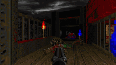
The excellent music used in the video is an OverClocked ReMix of one of the tracks from Final Doom: TNT - Evilution (the music that appears in levels 13 and 29). I really like the original track [MIDI file, 17 KB], and in fact, used it as the level music in my Doom II map Out of Phase 3. But this hypnotic remix completely blew me away, and that's why I used this piece in the video. The remix is called Clairvoyant Elegy and is a collaboration piece by Bladiator and TO (The Orichalcon). I highly recommend you download it.
Comments for this News Post
Brilliant one I say.

appears to be anymore. 4) Sitemaps can also organize
the structure of your respective site. When you post content and data on your Google Plus account,
be sure you post exactly the same re-written content on the other accounts
like Facebook or Twitter.
every one can easily understand it, Thanks a lot.
and design it truly stands out.
write.
entertaining, and allow me to tell you, you might have hit the nail on the head.
Your conceptis excellent; the issue is something that not sufficient individuals are speaking intelligently about.
I'm happy that I found this in my quest for something relating to this.
these things, thus I am going to let know her.
I'm amazed by the details that you simply have on this web site.
It shows how nicely someone perceives this subject.
Bookmarked this web site, will return for
more articles. You, my pal, ROCK!
You have some really great posts and I think I would be a good asset.
If you ever want to take some of the load off, I'd absolutely
love to write some material for your blog in exchange for a link back to mine.
Please blast me an email if interested. Cheers!
who are wishing in favor of blogging.
It is pretty worth enough for me. In my view, if all site owners and bloggers made good content as you did, the net will be a lot more useful than ever before.
It is very useful for me.
I appreciate seeing sites that gives a great useful resource absolutely free.
I really loved reading your articles.
ask.
for ages and yours is the greatest I have discovered thus far.
it is simple on my eyes and the information are well written.I am wondering how I could be notified if a new post has been made.
I_ve subscribed to your RSS which must do the trick! Have a
nice day!
I love what you've got here, truly like what you_re
stating as well as the way by which you say it.
You make it enjoyable. I cant wait to read much more from you.
This is truly a wonderful website.
and discovered that it_s truly informative. I'll be thankful if you continue this in the future.
A lot of individuals will be making the most of your writing.
Many thanks!
to others.
The article has actually speaks my interest. I'm going
to bookmark your website as well as keep checking for new information.
think you did a great job though! Thanks for this!


Dark Fate 2 is a singleplayer level for Doom II, replacing MAP01. It's a small-sized hellish level — and there's a walkthrough video as well.


27-year old Taurean (birthday 15-May-82), Assistant Manager - HR at Tata Consultancy Services Ltd in Hyderabad, India. Previously, did Post Graduate Diploma in Management from T A Pai Management Institute (2003-05) and before that, Computer Science Engineering from Sree Nidhi Institute of Science and Technology (1999-2003).
Email: karthik82 -AT- gmail -DOT- com
orkut profile
Facebook profile
YouTube channel
deviantART page
Google Reader Shared Items
Disclaimer: The views expressed on this site are purely my own.
Warning: This site occasionally contains profanity.
![[ Karthik82.com Logo ]](/design/5/logo.png)


