Dark Fate
Replaces: Doom II, MAP01
File Size: 142 KB
» Download
from Karthik82.com «
Download
from /idgames Archives
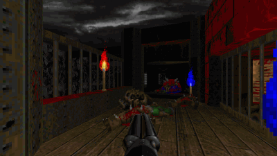
Dark Fate is an action packed Doom II level made in the style of the original Doom's episode 3, "Inferno". This level was made in 5 days, probably over a period of 20 hours or so. It has music replacements and some new graphics too. It is totally compatible with doom2.exe and does not require any enhanced engine to run.
It's a small size level, which will not take you much time to play. Actually, I was inspired to make a level of this size after playing Andy Leaver's rave.wad and Alex Parsons's ap_012.wad. Varun also did demos of both those levels. I should also thank him for suggesting some tweaks to this level so that it is more fun to record demos.
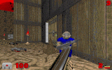
This level also supports deathmatch play, as you can see from the last screenshot. There are 8 Deathmatch starts, and for the size of the level, 4 players is recommended. I've tested it with ZDoom's bots, and it is fun to play (I played it under these settings: weapons stay, powerups respawn, drop weapons, nomonsters). Do let me know what you think of the DM play of this level!
Screenshots
This release of this level also celebrates my getting selected in T. A. Pai Management Institute (got to know the results on April 15) :)
Demos
27 April 2003 - Virgil the DOOM Poet sent me a first-try demo for the level.
21 April 2003 - Varun discovered a very cool rocket-jump trick on this map, and did a nomonsters speedrun of it in 0:43! You can get the demo from his site, Varun 20787.
21 April 2003 - Opulent did a maxdemo of my map in 2:22! You can get the demo from his site, the DSDA.
Reviews and Comments
6 June 2003: Eric Buck a.k.a. BluePaladin reviewed Dark Fate at the Doom Wad Station (link is to their review list page, scroll to see the Dark Fate link).
4 June 2003: Kak Home sent me this review for Dark Fate by email:
Design: The level is well built. The outside area is well done, as are the areas that branch off of it. Oh, and the nice opening area as well. It won't blow you away, but has a good, well-designed layout. Well done.
Design Score: 8.5/10
Gameplay: Gameplay is often a strong point of your levels, and that is no exception here. The level is not as hard as some of your others, but it offers a okay challenge, especially on higher difficulty settings. Very fun to play. The map is somewhat complex, but it does not get confusing. Awesome gameplay, very good job.
Gameplay Score: 9.25/10
Music: Wow. It really sets the theme to the map. Good sounding, atmospheric, and very moody is what describes it. My only complaint is that it gets slightly reptitious, but that is a very minor one at that. Very well done!
Music Score: 9/10
Textures: None; Texture Score: None
Sounds: None; Sounds Score: None
Architecture: Excellent. The Inferno style is very well captured, and the level has excellent texture choice and a high level of detail. Looks absolutely great, and is extremely atmospheric. This level beats the look of any of the original Inferno levels, hands down! The only reason I won't give more than a 9, like Congestion Control, is due to the lack of huge, amazing structures. Very well done!
Architecture Score: 9/10
Overall: Excellent level. I liked it very much, and it really beats the original Inferno levels hands down! Go get it!
Overall Score: 89%
27 April 2003: Doomworld's The /newstuff Chronicles #126 review by Hyena:
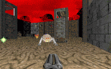
The best way I think to describe this level is "Hell Revealed for DooMortals" (DooMortals being a phrase I just invented--or that I think I just invented--for people who are not Adam Hegyi.) Beginners and Intermediate Doomers should be quite challenged by this one. And it's a lot of fun, too. It's packed with small to medium monsters, although I think it gives the player too much ammo and powerups. There is one Spider Mastermind to contend with, and several arch-viles, otherwise it's mostly cacos, hell knights, and sergeants hiding in tiny alcoves that ambush you just as you stop to take a breath. As a side note, I think the music really sets the mood.
19-21 April 2003: Comments posted at Doomworld.
20 April 2003: Joe Pallai was kind enough to do a very thorough review for Dark Fate! Here is what he had to say...
Level Review for DFT
Overall: A very fun, well paced level with menacing atmosphere. The opening nod to "Hell Keep" E3M1 was executed perfectly and the lighting was top notch. 87% is my score.
Critical Errors: Found None.
Design Errors: Finding the red key switch was a bitch. I thought I found it the third time (first demo), so I shot at it; but to no avail -- maybe the SSG isn't the right gun to hit the switch due to its spread. At any rate the texture didn't signify to me that it was a switch, just a firewall. I would change this to say that eyeswitch texture.
EDIT: Okay, I figured out this switch. From the caco hall, go into the side room and hit the switch, to open up the red key shootable switch. I didn't notice this the first time through. :(
The crushing trap doesn't really make much sense to me. Wouldn't you go in there first? Shouldn't the trigger be within the room?EDIT: Okay, with the light amp googles needed for the invisibility sphere, the room makes a bit more sense; but I still think the triggers need to be within the room to provide the player some danger.
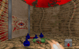
Aesthetics: Beautiful and menacing atmosphere. I loved it. Lighting was perfect in the outdoor areas, and nicely done overall. Some of the sprites got in the way, even though they were walkthrough sprites. Examples of this would be the soul sphere chamber where the revenant pops up. The chunk of meat hanging from the ceiling obstructs the view of the revenant; which in my opinion is a bit more scary than the meat. The room looks good without it. Also the hanging guys up in the northwest room overlooking the courtyard, seemed a bit much in such a small room. I loved the level's start room; it perfectly captured E3M1 "Hell Keep"'s opening area. Beautifully done.
Texture Alignments: Didn't notice any but unless they stand out I don't see them. Also was too busy staying alive and trying to figure out where the red key switch was.
Ammo/Weapon Placement: No complaints, I like how you use foreshadowing with the chaingun and the rocket launcher to signify to the players the best choice in weaponry for what's behind each door. (This is something that I try to do in my maps).
Enemy Placement: I like the steady, managable pace (I was on HMP -- it could be a different story on UV). Constantly busy. I also like the arch-vile trap in the soul sphere chamber. I didn't expect that the first time; nice.
Maybe having a pain elemental instead of a caco in the lightgoggle/beserk pack room would work a little better and help eat up some of that excess shotgun ammo. Also if the baron in that room teleported out behind the player while the caco came out through the window would have been a better fight.
Health Placement: No complaints.
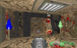
Bonus Items Usage: I loved the potions and helmets up on the windowsills. The Light amplification goggles seemed unnecessary; so far I haven't needed them in this level.
EDIT: I figured out why you put them in the map, to find the invisibility sphere secret -- I'm just not sure if it's needed to go up against the Spider Mastermind. You gave us the BFG and a soul sphere; that Spider Mastermind has little chance against us in the courtyard.
Misc.: It sounds like I'm knocking your level to pieces. I'm not, I enjoyed it very much; I just think certain things can be better. You have great ideas and very fun maps. Keep up the good work.
-- Joe


Dark Fate 2 is a singleplayer level for Doom II, replacing MAP01. It's a small-sized hellish level — and there's a walkthrough video as well.


27-year old Taurean (birthday 15-May-82), Assistant Manager - HR at Tata Consultancy Services Ltd in Hyderabad, India. Previously, did Post Graduate Diploma in Management from T A Pai Management Institute (2003-05) and before that, Computer Science Engineering from Sree Nidhi Institute of Science and Technology (1999-2003).
Email: karthik82 -AT- gmail -DOT- com
orkut profile
Facebook profile
YouTube channel
deviantART page
Google Reader Shared Items
Disclaimer: The views expressed on this site are purely my own.
Warning: This site occasionally contains profanity.
![[ Karthik82.com Logo ]](/design/5/logo.png)
