Sherlock Holmes
I did this drawing of Robert Downey Jr from the Guy Ritchie movie Sherlock Holmes sometime back. It was done with a 6B pencil and then touched up in Photoshop —
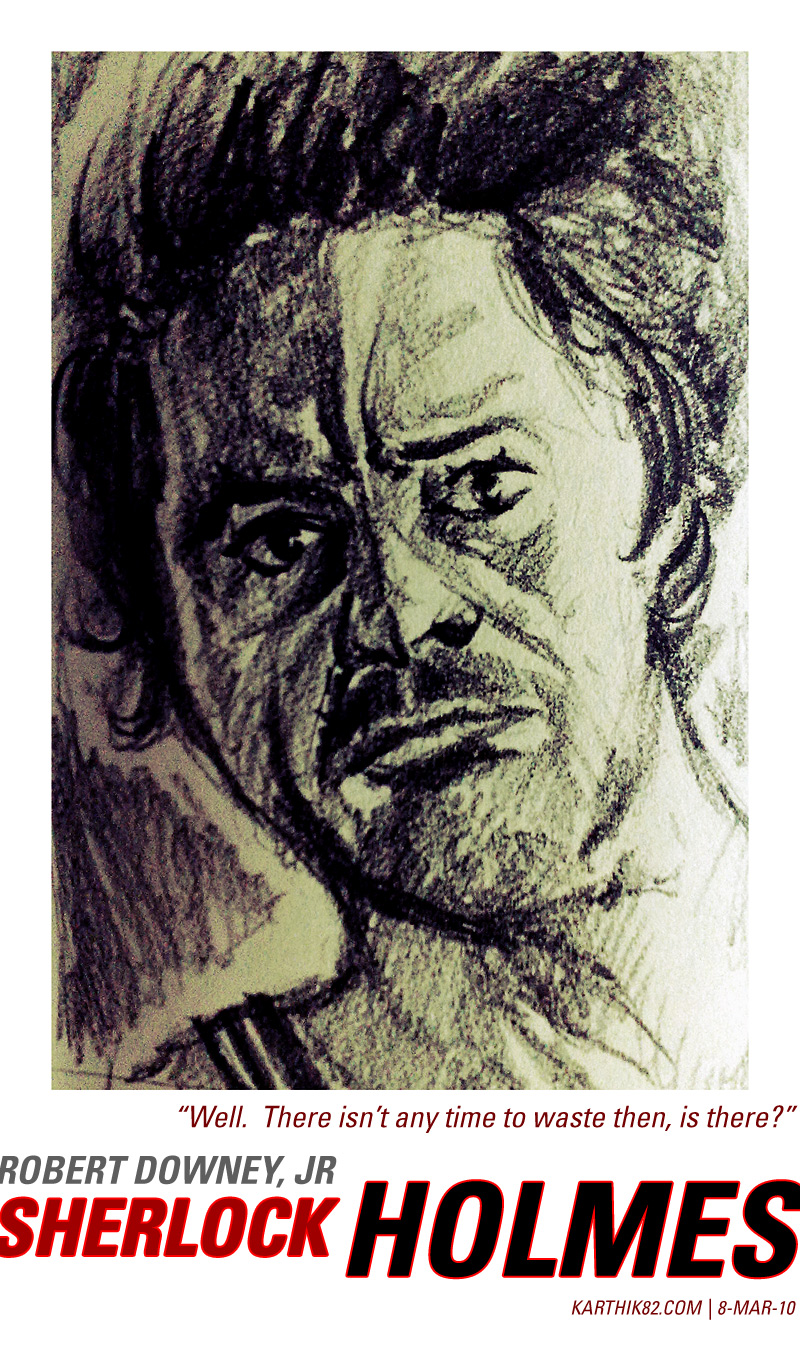
The drawing was done quite quickly. It was actually intended to be part of a series of drawings based on movies I'd seen recently, but this was the only one I completed. I tried to do something different with the typography this time. The text is in Univers Bold Condensed Oblique, which being from 1957 is a more modern typeface than appropriate for Sherlock Holmes, a late 19th century character. But it looked good, so I went with it!
What about the movie itself? I got to see it in a theatre, but in a rather uncomfortable seat (corner seat in the first row from the screen), but still enjoyed the movie a lot. I was initially skeptical of how the movie would turn out, since Guy Ritchie was an unconventional choice of director, Robert Downey Jr was an unconventional choice to portray Holmes (but I thought Jude Law as Watson was inspired casting) and the trailers made the movie seem like an action-packed adventure almost bordering on a parody of the character. Surprisingly, the movie was a balanced take on the character, providing the necessary action while still remaining true (at least in my opinion) to the spirit of the character. I say this having only a limited exposure to the actual character — I studied The Hound of the Baskervilles for two years in school (Class IX for "Special English"and Class X for English) and also have read a few of the short stories. I thought the movie captured the characters quite accurately, albeit a younger version of them.
The movie opens with Holmes and Watson apprehending the villain Lord Blackwood (Mark Strong), who before being executed, warns Holmes that he will rise again, and that there will be more murders. And true to his word, Blackwood's body disappears from his tomb, and people start dying. It is up to Holmes and Watson to figure out how to stop Blackwood. The movie had some nice twists. The themes of whether the goings-on are supernatural or have a rational or scientific explanation actually made me think of Tim Burton's Sleepy Hollow (which was also set at the end of a century, where the future promised to bring new technology).
The movie was nicely photographed (Philippe Rousselot) and I loved the music by Hans Zimmer ("Discombobulate" from the soundtrack is an awesome track). The song "The Rocky Road to Dublin" by The Dubliners appears during the boxing scene in this movie and I have become a big fan of it. It is probably Guy Ritchie's most mainstream movie. The end credits design is by Danny Yount and Prologue Films (who did the opening animation for Ritchie's previous RockNRolla. Check out this great article: Sherlock Holmes End Credits Sequence, Danny Yount Interview. Well, that's all I have to say about the movie now, maybe I will think of some more things once I watch it again!
Oh, before I forget, here is a video of me doing the drawing seen above —
The typeface used in the video is Akzidenz-Grotesk, which being from 1898 is only slightly anachronistic!
Lost — Mysteries of the Island
The final season of Lost started on 2-Feb-10, and I have been watching episodes of the show as and when they come out. However, shortly before this season started, I did this drawing called "Mysteries of the Island". Here it is, below —
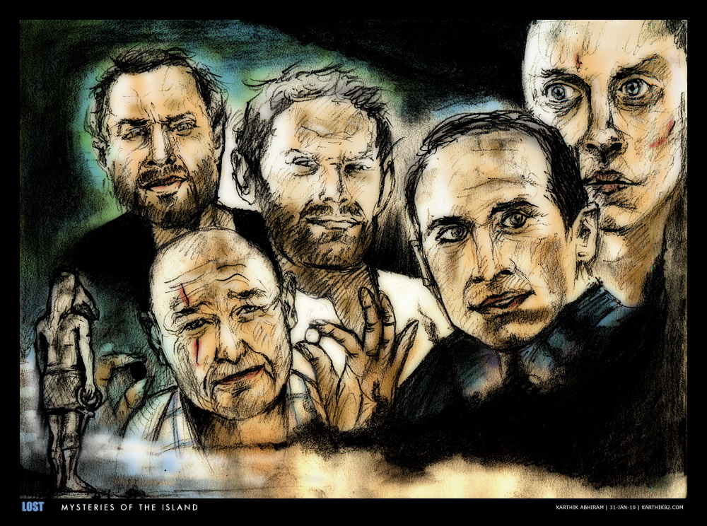
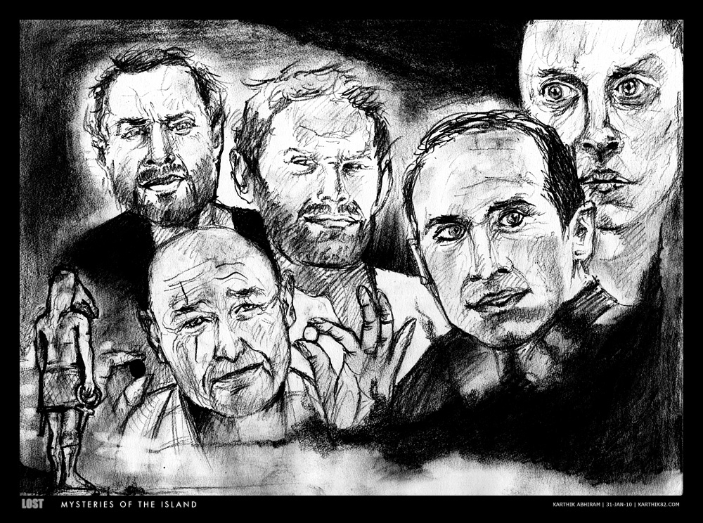
This drawing was done very quickly with a pencil and then coloured in Photoshop. For those of you who watch Lost, you'll know the significance of the characters represented in this drawing — they are all characters in the show who have a deeper "connection" with the mysterious island. There's Jacob and his Nemesis, there's John Locke holding up black and white backgammon pieces (which could have a connection with Jacob and the man in black, his enemy), Benjamin Linus, Richard Alpert (who never grows old), the Smoke Monster, and the Taweret statue. A lot of questions have been raised by the creators of the show over the past five seasons. Let's hope they wrap up everything in Season Six! Below is the uncoloured version of the drawing —
Over the past few months, I have become very interested in typography. Hence, rather than just using any font for captioning the picture, I picked three typefaces which have a connection to the show itself. The title Lost is set in Impact (the same old font that comes with Microsoft Office). The text "Mysteries of the Island" is in Futura, like the opening titles in each episode of Lost. My name and the date of the drawing is set in Verdana, like the white "LOST" that appears at the end of each episode. I read an article sometime back about the typography in Lost. The article pointed out that the use of fonts on the show was quite inconsistent. Quite funny that when the title designers had access to several professional fonts, they went ahead and picked fonts from Microsoft Word instead! Verdana for example, has no place at all, since it was a font designed for readability on the web. The Verdana "LOST" at the end of each episode also has a rather crude Photoshop bevel and emboss effect. That inconsistency bothered me as well, from the first time I saw it. However, one has to appreciate the innovative opening title sequence in Lost. It is very different from the typical title sequence you'd find in other TV shows. J J Abrams apparently made it on his Mac as a temporary placeholder sequence, and it stuck!
Below is a video of me making this drawing. You can see whatever I've talked about in the post, right from the references I used, to the pencil work, the typography and colouring. The same fonts I mentioned are used in the video too. I've tried to imitate the "Verdana ending" as well, and I've used the same sound effect that appears at the end of every Lost episode. However, the sound seems to be clipped off in the video so it isn't very audible. You can try turning the volume way up to hear it.
The excellent music used in the video is an OverClocked ReMix of one of the tracks from Final Doom: TNT - Evilution (the music that appears in levels 13 and 29). I really like the original track [MIDI file, 17 KB], and in fact, used it as the level music in my Doom II map Out of Phase 3. But this hypnotic remix completely blew me away, and that's why I used this piece in the video. The remix is called Clairvoyant Elegy and is a collaboration piece by Bladiator and TO (The Orichalcon). I highly recommend you download it.
Happy New Year!
EDIT [3-Jan-10, 01:38]: The 2010 New Year Card is online. View it here. There's an image as well as an embedded video to watch!
Well, there's just a few minutes to go before it isn't New Year's Day anymore, so I thought I'd make this post before that happens. If you're reading this, wish you a very Happy New Year!
As per tradition, every year, there's a New Year Card uploaded on my site, and this time also there will be one. I couldn't finish what I wanted to do in time though, so that's why it isn't up yet. I will edit this post when the card is uploaded and email people.
The Gold Watch
EDIT [18:44]: I just checked IllustrationFriday.com and saw that the topic for this week is "Pioneer". So I'm submitting this drawing for that, since Quentin Tarantino in my mind is a pioneer in cinema!

I had this idea sometime back, to do a bunch of drawings inspired by Quentin Tarantino movies (this because the typical collage type drawing wouldn't suffice — there are too many memorable characters from Tarantino's movies!). The first one that I did was one of Christopher Walken as Captain Koons from "The Gold Watch" sequence in Pulp Fiction. Here it is below —
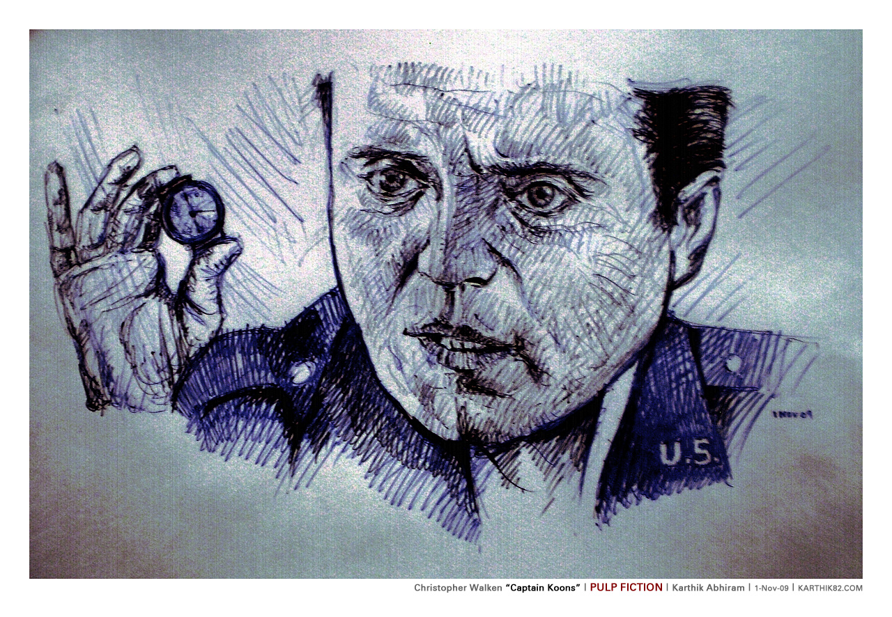
That was done with a black and a blue ballpoint pen. The above image is a photo (not a scan) of the drawing, tweaked a bit using Curves in Photoshop. And as you might have guessed, there is a video of me drawing this, which is embedded below —
I tried to replicate the Tarantino "trunk shot" in the video. The typefaces used in the video are all from Tarantino movies — Friz Quadrata Bold, Avant Garde and Benguiat. The music used in the video is called "Express to Goo Land" and is an early piece by my good friend Pablo Dictter.
Returning here after a while, Merry Christmas!
I've been on hiatus for a long while due to some personal matters. Suffice to say, it's affected normal activity (movies, art) for me for the past few months. Anyway, things will be getting back to normal around here, and to start off, here's wishing everyone a Merry Christmas. I'm posting an unfinished drawing that I started doing in September, featuring some movies I'd watched around that time —
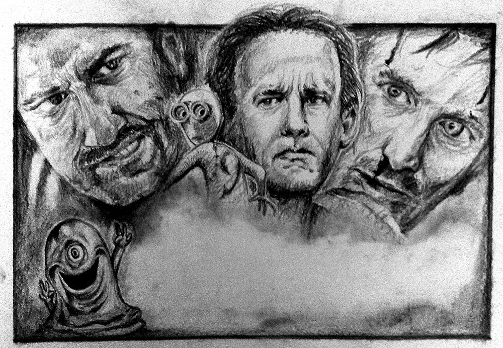
This one is notable since I did it in pencil (4B and 6B), as opposed to ballpoint pen like some of my other drawings. The version I've put up here is a photo and not a scan. My Best Movies of 2009 drawing is due soon, and I'm doing that also in pencil, inspired by what effects I could get with this piece (so you see, it's not entirely a waste).
The movies featured in this picture (you can guess) —
- Gamer — A fun little movie from the creators of the Crank movies, Mark Neveldine and Bryan Taylor. In the future, players will be able to control real humans in an FPS game called "Slayers", and a participant (typically a death row convict) who survives 30 sessions will get to go free. Gerard Butler is Kable, a man who has only a couple of sessions to go to freedom. Entertaining. Rating: 7/10
- 9 — A sock puppet (number "9") awakens in a future world where humanity is dead. What happened to the world and why are there mechanical beasts that want to destroy 9 and the other puppets like him? Shane Acker's atmospheric animated feature must be seen on the big screen. Rating: 8/10
- Angels & Demons — Slick movie with high production values but strangely underwhelming. The plot involves Dr Robert Langdon racing against time to save kidnapped Popes from death, and thwart the Illuminati who want to detonate a doomsday device. Rating: 7/10
- District 9 — Stunning science fiction movie from writer/director Neill Blomkamp that is definitely one of the best movies of the year! In 1982 a huge spaceship shows up over Johannesburg, however, first contact is not at all like what we imagined, since the ship is populated with malnourished and dying aliens. The creatures (dubbed "prawns") are made to stay in the shanty-town District 9. 28 years later, the MNU (Multi National United) initiates an effort to relocate the aliens to a different colony, and official Wikus Van De Merwe (Sharlto Copley) has an encounter with alien technology that will forever change his life. Extraordinary movie with some stunning CGI and brilliant action and gore sequences! Rating: 10/10
- Monsters vs Aliens — Underwhelming movie about a group of monsters under US Government supervision who must team forces to save Earth from the evil Gallaxhar. Some bits are funny but otherwise I expected a lot more from this movie (considering that the screenwriters of Kung Fu Panda were also involved in this). I didn't see it in 3D though I doubt the extra dimension would have helped much. Rating: 6/10
Next post, I will put up one more drawing I did, and that's a completed one.
Movies Watched — August 2009
Here is a drawing I did showing some movies that I watched in August 2009. I am currently working on a drawing showing the more recent stuff I watched, that I will upload once it's done. The below image was created out of a bunch of pencil drawings — I put them together in Photoshop along with the mini-reviews. The typefaces used are Museo (for the headings) and Franklin Gothic Medium Condensed for the text. You can download a 2560 × 1600 desktop wallpaper version (2.2 MB) by clicking on the image below.
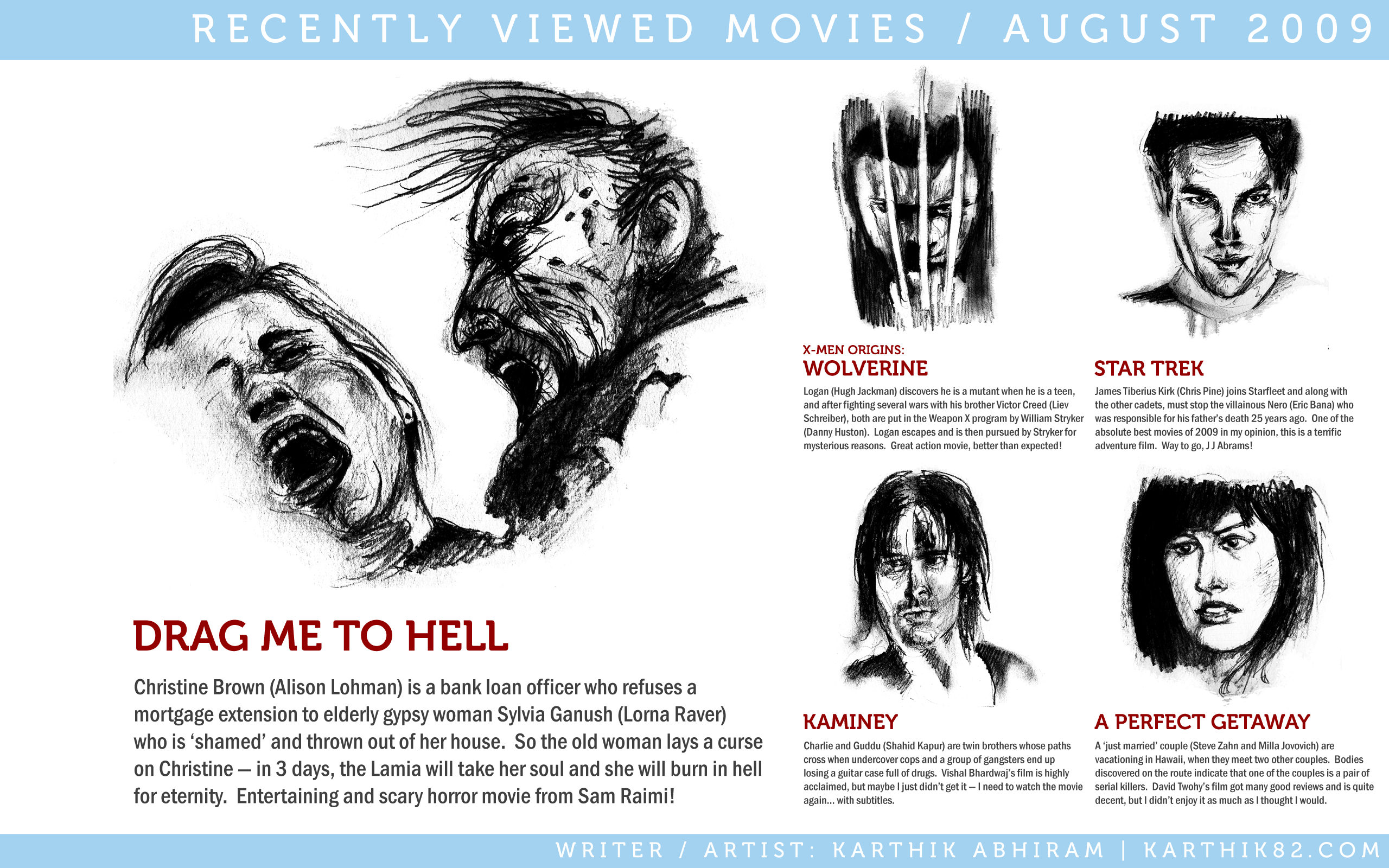
The standout movies out of this bunch would have to be Star Trek which would definitely find a place in my "Best Movies of 2009" list, and Drag Me to Hell which was a fun little movie.
Halloween II — Fan Poster and Video
ShockTillYouDrop.com announced a contest towards the end of July, where one can create a fan movie poster for the upcoming Rob Zombie movie Halloween II and submit it to them. The contest ends August 28 (the release date of the movie). The winning entry will be selected by Rob Zombie and the submitter will get a print of the poster signed by Zombie. I am not sure whether the contest is open to entries outside the US, but regardless I thought it'd be a cool thing to do, so I made a poster —
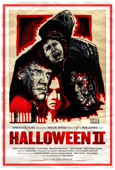
Click on the image above or here, to view the poster on my gallery. You can also watch a YouTube video that shows the entire process of creation of the poster. It took a lot of effort (many hours of work spread over the last two weekends) to make the poster as well as the video, but I am very happy with the end result. Let me know what you think!
The Book of Eli — Drawing and Video
Recently, I got to see the trailer for The Book of Eli, an upcoming science-fiction action movie starring Denzel Washington, Gary Oldman and Mila Kunis. The trailer was released at Comic-Con International, and looks quite nice. The movie will be released in 2010 and is directed by Allen and Albert Hughes. I was quite inspired by the trailer and so I did this drawing after watching it —
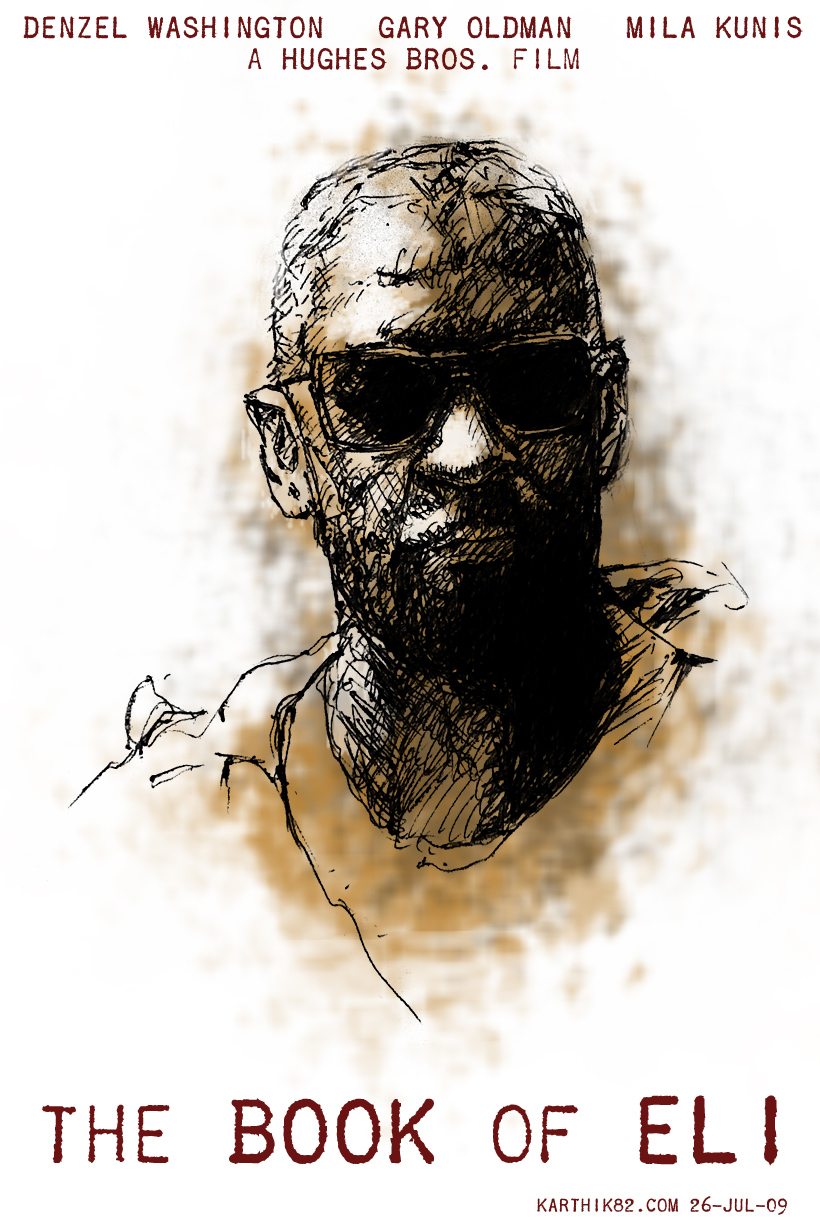
Nothing fancy, the drawing was done with ballpoint pen, a photo was taken and that was coloured digitally. The drawing was intended to be part of a larger piece, with the movies that I want to see in 2009-10 (similar to what I did last year). I also filmed footage while drawing this, so I put that together into a video and uploaded it to YouTube.
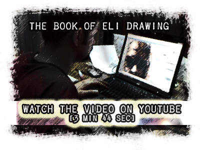
You can watch the video by clicking here or on the above image. I think the video came out pretty nicely. The music track I used in the video is the "Survivalism (Celebmix)" by Celebutante, from the open-source Nine Inch Nails Remix Album, The Limitless Potential.
"Lost" Drawings
As I'd mentioned in an earlier post, I started watching the TV show Lost in June, and by now, I finished watching all 5 seasons of the show. Without a doubt it is an excellent TV show — with well-written characters, intriguing mysteries and plenty of twists to keep things interesting. I am waiting to watch episodes of Season 6 in 2010! In the mean time, here are two drawings I did based on Lost —
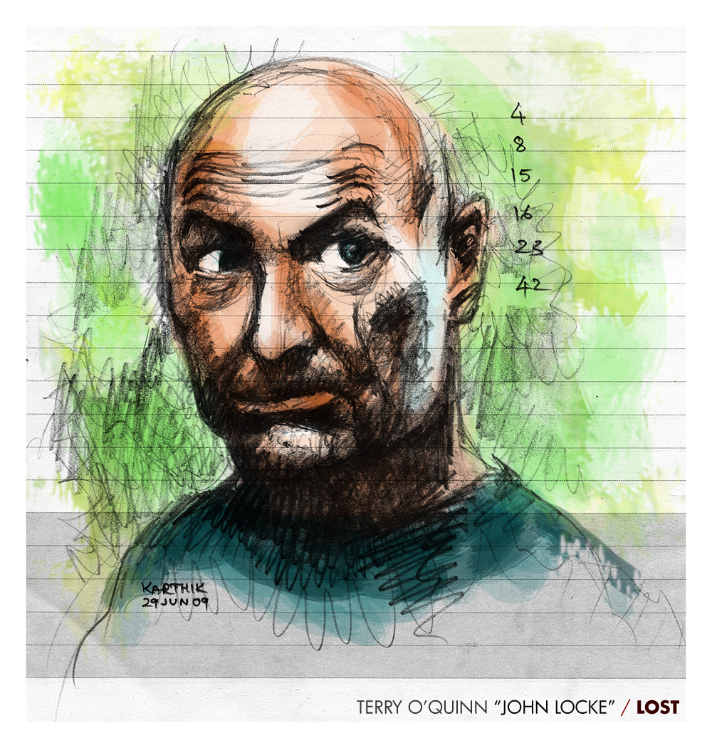
This is a picture of Terry O'Quinn as John Locke, one of my favourite characters from the show. I did this at the time I was watching Season 2, hence the "Lost numbers" — 4 8 15 16 23 42 — are on the drawing. The characters are told that they must enter these numbers into a computer terminal every 108 minutes to prevent the end of the world!
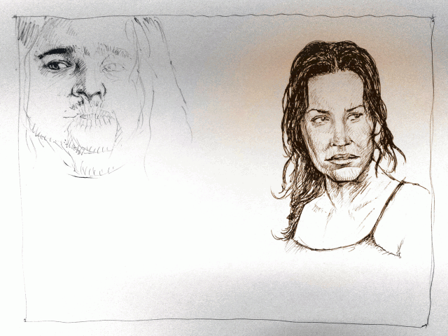
The above is a picture I started drawing, and features Evangeline Lilly as Kate Austen and Jorge Garcia as Hugo "Hurley" Reyes. I plan to do more of these character drawings later, and I especially want to do one of Michael Emerson as Benjamin Linus (I still think of "Hello Zepp" from Saw when I see him).
[ news archive ]


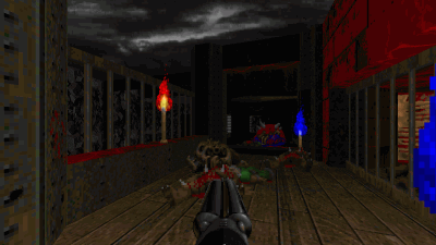
Dark Fate 2 is a singleplayer level for Doom II, replacing MAP01. It's a small-sized hellish level — and there's a walkthrough video as well.


27-year old Taurean (birthday 15-May-82), Assistant Manager - HR at Tata Consultancy Services Ltd in Hyderabad, India. Previously, did Post Graduate Diploma in Management from T A Pai Management Institute (2003-05) and before that, Computer Science Engineering from Sree Nidhi Institute of Science and Technology (1999-2003).
Email: karthik82 -AT- gmail -DOT- com
orkut profile
Facebook profile
YouTube channel
deviantART page
Google Reader Shared Items
Disclaimer: The views expressed on this site are purely my own.
Warning: This site occasionally contains profanity.

Powered by PHP, Apache and MySQL. Web stats by StatCounter. Hosted by Answerable. Layout is inspired by Derek Punsalan's Grid Focus theme.
I wrote all the code here, and it should be Valid XHTML 1.0 Transitional.
[ Jigsaw | Oh yes, there will be blood ]