The Karthik82.com Archives
Johnny Gaddaar
Like I mentioned in the previous post, I bought the DVD of Johnny Gaddaar on Saturday, and watched the movie today. Very nice movie, it came out in theatres here a couple of months ago but I couldn't watch it on the big screen. Anyway, I guess watching it on DVD is a better experience, as you have the subtitles and a few nice special features to go along with it too. The movie is written and directed by Sriram Raghavan, who earlier made the thriller Ek Hasina Thi for Ram Gopal Varma.
Johnny Gaddaar is a crime thriller with a dark sense of humour. There is this group of five people who pool in money to negotiate a deal over four days, that will get them a sum total of Rs 2.5 crores. This "gang" consists of retired smuggler Seshadri (Dharamendra), gambling club owner Prakash (Vinay Pathak), Shardul (Zakir Hussain), Shiva (Dayanand Shetty) and Vikram (Neil Nitin Mukesh). Vikram is secretly in love with Shardul's wife Minni (Rimi Sen), and what's more, he decides that stealing the entire sum of money is better than settling for just his share. But then as Alfred Hitchcock once said, murder is always a messy thing — can Vikram keep his deception of the group a secret?
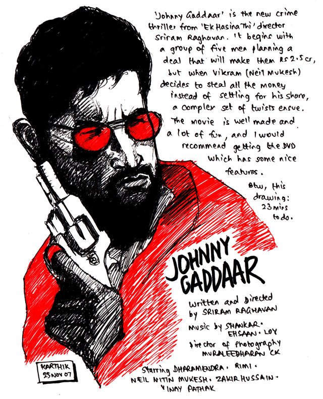
The movie is very stylish and fast paced. The opening credits are done in the style of a 1970s gangster movie, and the music is nice as well. The DVD (from Big Home Video) comes with a nice anamorphic transfer and the picture and sound quality were very good. I had a look at some of the extras on the disc — there is an alternate ending which isn't that different from the ending in the actual film (in fact the current one works better, I think), a couple of music videos, and some amusing blooper footage. The meat of the extras though, are the commentary track with the director, director of photography (Muraleedharan C K) and editor (Pooja Surti), which I haven't had the chance to check out yet. Anyway it's a good movie, and I'd rate it an 8/10.
Once again, there's a quick drawing I did to accompany this post — you can see it above (click for a larger version). This was done with a black ballpoint pen, red gel pen and a black sketch pen. This time, I actually used the stopwatch feature on my cellphone to see how long I took to draw it. Took 23 minutes to do.
Today's DVD Purchases!
Like I mentioned in the previous post, I watched Happy Days today at Prasad's Multiplex. But that place also has several shops, so apart from watching the movie, I also blew up some money today. To be exact, Rs 1923. I bought a number of DVDs and one game package, as illustrated by the photo below —
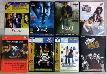
The list is as follows (clockwise) —
- Yuva: I remember Kamal and myself hunting for a good quality VCD of this movie some years ago in Manipal. Strangely enough, I never got around to watching this movie (neither this Hindi version, nor the Tamil version Ayutha Ezhuthu)! This DVD is a pretty OK quality copy, except that it doesn't have an anamorphic transfer! It is letterboxed to a wide aspect ratio. Anyway, I'm looking forward to watching this sometime.
- A Film by Aravind: Varun told me about this movie and that it was good, so I bought the DVD.
- Athadu: Starring Mahesh Babu! Seems like a very stylish movie, and I've heard that it is very good.
- Go: No, not the John August-written/Doug Liman-directed Go, this is a Hindi movie starring Nisha Kothari and produced by Ram Gopal Varma. I don't think the movie is that good, because it sat unreleased for more than a year. I say this, because I saw the trailer of the movie in May 2006 (Rajith and me went to see Tathastu on my birthday that year), and was looking forward to watching it, but it never came out! Finally a couple of months back, it had a very brief run in theatres and is on DVD now, so I got it.
- Johnny Gaddaar: I didn't get to see this movie on the big screen, so got the DVD. The disc seems to have a very nice transfer, and it has a nice bunch of special features too (commentary featuring writer/director Sriram Raghavan, director of photography Muraleedharan C K and editor Pooja Surti; alternate ending; "making of" and a couple of music videos). Besides, with that stylish cover artwork, how could I resist buying the disc? Going to watch this very soon.
- Munnabhai MBBS: Moser Baer released this at an absurdly low price (Rs 34 — compare to Johnny Gaddaar which costs Rs 299), so really, there was no reason not to get it!
- Ek Chalis Ki Last Local: I already bought this on VCD sometime back, but then again this is a low-price Moser Baer disc, so bought it for the better video and subtitles.
- The Orange Box: I wrote about the game Portal in a previous post, and was looking forward to play it. So when I saw The Orange Box, which, incredibly, contains five full games (Half-Life 2, Half-Life 2: Episode One, Half-Life 2: Episode Two, Team Fortress 2 and Portal) at a very low price of Rs 999 (in comparison: HL2 costs Rs 1299 if you buy it individually) available here, I immediately got this package. Of course, I don't have much hope that it'll run properly on my laptop, so I guess I bought it more for Varun than for me. Varun has exams now though, so we'll be opening this package on Monday, when he'll be done with this set of exams.
So, I guess the drawing I do this weekend (tomorrow) will be based on one (or more, if time permits) of these movies!
Happy Days
I watched the Telugu movie Happy Days today at Prasad's Multiplex. Went for this along with three colleagues from office, Ashok, Palani and Prabhu. We went there for the 1:45 PM show, but as I'd reached there a bit early, I went inside a store selling games and bought The Orange Box (but more on that later). The movie is written and directed by Sekhar Kammula and I'd heard a lot about it, so I was eager to watch.
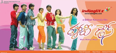
The movie is set in Chaitanya Bharathi Institute of Technology (CBIT), and follows the lives of eight Engineering students and their relationships during the course of four years. Was a very nice movie, and I really enjoyed it. Simple story and well executed. Of course, it's a credit to the director that he kept things grounded in reality for the most part (a few scenes required one to suspend disbelief, but everything else was realistic), as a result you could relate to what was going on. If you've studied Engineering in any of the colleges here, you'll almost recognise situations and people you knew, in the situations and characters in the movie! Of course, the "other side" of Engineering, dealing with the dull and unnecessarily large number of exams and everything, was not focused on much at all (heh, heh). But then that wouldn't make a very interesting film, now would it!
The acting in the movie was nicely done and I loved the soundtrack (credited to one Mickey J Meyer — who, despite the name, is from Hyderabad it seems, according to Wikipedia). The movie reminded me of Chennai 600028, another simple, natural but very entertaining film. Just different sets of people at different points in life in these two movies.
One interesting thing, I found while looking at the Wikipedia entry for Sekhar Kammula — apart from the fact that he studied in CBIT (Mechanical Engineering), where the movie is set, it seems he also did his schooling from St Patrick's High School — the same school Varun and myself studied in! I guess he would have been several years my senior, though. Anyway, after the movie was over, I stopped in the Sangeet Sagar outlet inside Prasad's and bought a bunch of DVDs (again, more on that, in the next post).
The Dark Knight in IMAX, and Police Academy OST
There's been a lot of publicity and viral marketing for the movie The Dark Knight, which is a sequel to 2005's Batman Begins from director Christopher Nolan. The film is going to be released in the Summer of 2008, and it looks awesome. The latest news, though, is that Nolan is shooting parts of this film in the IMAX format! There is a video available at the IMAX website, which has a short interview with Nolan and Director of Photography Wally Pfister, which you should check out.
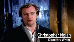
The video is quite insightful, and towards the end, Nolan says that the IMAX format would take one back to the old days, where seeing something on a large screen would inspire awe. I can certainly agree, having seen a few IMAX films (both regular films converted to this format, and films shot for the format itself), that the experience is definitely far beyond seeing a movie in a regular theatre.
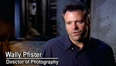
Wally Pfister has shot all of Nolan's films till date — Memento, Insomnia, Batman Begins, The Prestige (by the way, he received Oscar nominations for the last two), and he talks about the advantages of shooting in this format (with respect to resolution and something called lighting latitude, which I guess is the same as exposure latitude). Apparently the cameras are also four to five times heavier than the standard cameras used to shoot movies, which means that they had to approach rigging up shots differently as well. Anyway, this is just another reason to look forward to The Dark Knight! By the way, the music in that video clip is awesome (I guess composers James Newton Howard and Hans Zimmer are back for another round)!
In other unrelated news, I got this today — a bootleg soundtrack album of Police Academy!
Shoot 'em Up
Yesterday we had the day off because of Thanksgiving (reminds me of Eli Roth's fake trailer from Grindhouse!), which was good. I got to relax at home and watch a movie as well. The movie in question is Shoot 'em Up, which stars Clive Owen, Monica Bellucci and Paul Giamatti, and is written and directed by Michael Davis. If there's a movie I've seen that lives up to its title, this is it! At 85 minutes, this is a very short movie, but it manages to pack in enough bullets, twisted humour and all-around awesomeness to fill two movies!
The movie begins with a mysterious drifter Mr Smith (Owen) sitting at a bus stop minding his own business and chewing on a carrot. He soon witnesses a pregnant woman running into some sort of warehouse, and she is being pursued by what appear to be professional hitmen. He steps in, delivers her baby and kills all the bad guys (note: one of them is killed with that aforementioned carrot), but the woman is killed off by accident anyway. So, Smith takes the baby and runs, but is confronted by mysterious assassin Hertz (Giamatti), who is apparently the leader of the horde of bad guys who just poured in! Smith escapes though, and now must protect the baby, because it's obvious that Hertz wants it for some reason.
It is important to note that all this happens in the first ten minutes of the film — this should give you an idea of the relentless pace of the movie. Also I believe this is the first time I am seeing a vegetable used as a weapon. From here on, the movie moves quickly from one action scene to the next, but provides enough plot too to keep things interesting. Smith takes the baby to a prostitute DQ (Bellucci) and asks for her help. She is reluctant at first but soon agrees to help out Smith, and the two of them go on the run from Hertz. The story is a bit convoluted and the explanation offered for why Hertz wants the baby is quite bizarre, but in a movie where a guy can get killed with a carrot, this is perfectly acceptable. The movie is incredibly, outrageously, entertaining and wraps things up pretty nicely at the end. What more can one expect?
Lots of talent here behind and in front of the camera — the acting is excellent and the film is photographed by Peter Pau, the Academy Award winner who shot Crouching Tiger, Hidden Dragon. Writer/director Michael Davis here is like a demented John Woo, the action scenes are very well staged (you'll be happy to know, they didn't tone down the violence or anything) and there are several touches of black comedy as well. At the end of the movie you'll have a big silly smile on your face. The movie rates a 9/10 at least, in my opinion, and I think anyone who likes action movies will enjoy this very much.
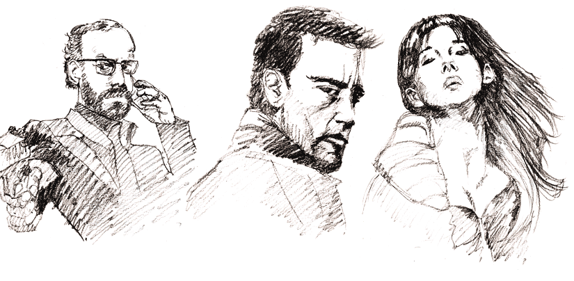
And as you may notice, I did a quick drawing of the three principals from the movie (from L-R, Giamatti, Owen, and Bellucci) based on the posters. This was done in 8B pencil (yes! 8B! The reason I had one is that I got a pack of drawing pencils as a gift, and it was on the table when I decided to start drawing, so just thought I'd try it out), and you can click the image above for a larger version. An interesting thing is that the filesize of these images is very small (825 × 404 pixels and just 83 KB), as they are 32-bit PNGs (but I guess, it's the rough nature of the picture that allows this low bpp setting to be used).
Note: see also Versus, for another movie that is full of action like this (but Shoot 'em Up is more satisying).
Inspired by Ramos
At work we have cab facility for pickup and drop every day, and one has to register their schedule on a roster for this (hosted on the company intranet). If there's a change in schedule though, there's an ad hoc cab request form which one has to get filled up and use to get a drop allotted. The point of saying all this is that, one day myself and some of my colleagues had a bunch of these printed out, but they turned out wrong (wrong page settings), so rather than disposing of these sheets of paper, they were deposited on my desk. I've been using them to scribble random doodles on the blank side.
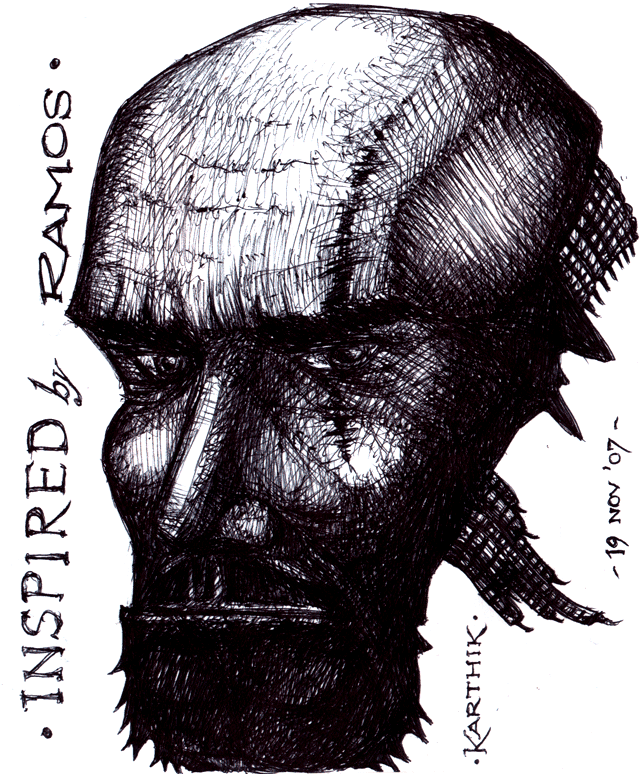
Today I did the picture you see above (click the image to see double-sized). It was done in black ball-point pen. No particular source or anything, just a weird male face. The caption says "Inspired by Ramos", because it was inspired by this amazing piece of artwork by Mexican comic-book artist, Humberto Ramos. Not that they share any similarities, but the inspiration definitely came from Ramos's page. I wish I could do something of that level of quality!
EDIT: 09:25: Apparently that link I posted is an old one, Ramos has since set up a Wordpress-powered blog here. On the new blog, you can see his Fight Club piece (which I have been talking about) and this Harry Potter Commission (colour work) which is also beautiful. Personally, I haven't read any of the books and only watched the first four movies, but this painting is great all the same.
Russian Horror: Trackman
Yesterday I watched this Russian Horror movie called Trackman (Putevoy Obkhodchik). It is directed by Igor Shavlak. The story goes like this: a group of people hold up a bank and take a few hostages, and in order to escape from the cops go on the run, and make their way into the abandoned railway tunnels beneath Moscow. And, soon they are picked off one by one, by the mysterious Trackman! The Trackman is a huge hulking guy who carries a device with which he gouges out his victims' eyes. The group must team together and find a way out of the tunnels before the Trackman gets to them all.
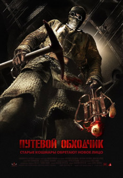
Sounds awesome, right? Sure, the story isn't anything special (think From Dusk Till Dawn, except instead of a vampire movie you have a Jason Voorhees-type slasher after these poor souls), but with the right execution, this would have been one memorable movie (and, just check out that awesome poster above!). Sad to say this was not the case at all. These people had access to some nice grimy tunnels to shoot this movie in. But it wasn't used to its potential at all. Zero tension, no scares (a few fake boo-scares would have been much appreciated), and a "monster" that was ineffective for the most part. Often, the Trackman would come up to someone and then disappear without doing anything, atleast if they had used these occasions to throw in some fake scares it would have been good, but we didn't get that also! They could have piled on the gore or the violence to make it memorable, but even in this department, it felt they were playing it safe by not showing anything too disturbing.
The worst offender though for me, was the characterisation. None of the characters (now, this includes the Trackman as well!) were developed, as a result, you don't get to know anything about them and thus won't care. It didn't help that some of the characters were irritating as well (the cop). Comparing the movie with From Dusk Till Dawn again — many of the characters in that film were scum. But you got to know their motivations so cared about what happened to them. Plus they were cool. Nothing remarkable here though. On the positive side I have to say some of the scenes looked pretty nice (the opening scene, where two characters plan the heist was stylish, but it felt like it belonged in a different movie). But on the whole, Trackman was a big disappointment for me.
I've only seen two other Russian movies till date, the fantastic Night Watch (Nochnoi Dozor) and its sequel, Day Watch (Dnevnoy Dozor) from director Timur Bekmambetov. Perhaps my expectations were unrealistically high for Trackman on the basis of those two. Still, I wish I could highlight something as being extremely remarkable about it, but there is nothing like that to be found here. It feels fake and empty somehow. Curiously, the Sanjay Dutt movie Dus came to mind, which aspired to be a crime/spy thriller but fell completely flat.
Teleport Destinations #6
I wanted to post these links last week itself, but didn't get around to it. Not many this time though, but take a look —
- This one is a link that Jayakanthan pointed out to me. There's an article at the film review site Pajiba on the "Greatest Trilogy of All Time". Jayakanthan asked me to guess, and I though it'd be either Star Wars or The Lord of the Rings, but then I was pretty shocked to find out what it was — The Evil Dead! Now don't get me wrong, I think those movies are awesome, but they're definitely not the kind of movies that an extremely critical-type website would choose as the "Greatest" of all time. But read the article and you'll be convinced.
- Another one from Jayakanthan: this gallery of artworks. This is a collection of drawings and sketches by famous artists representing either authors or characters they admire, from literature. Lots of great names in both categories (artist and subject) on the site!
- This one, I came across sometime back, from the Drawn blog, I think. The Superest is a blog with a simple challenge. Artist A draws a superhero with a particular power, and Artist B has to draw one with a power that can defeat the previous one! Very creative stuff here.
- This one is simply amazing. Artist Euan Mactavish started this forum thread at Drawing-Board.org, where he is putting up his digital paintings of famous women celebrities, one for each letter of the alphabet! I love these illustrations, and my favourite ones are his portraits of Salma Hayek and Jennifer Garner. His blog has posts which show off these portraits three at a time, so you can check them out more quickly there. Of course, you can also look at more of his wonderful art. Man, I wish I could draw like that! I'd also like to do something like this though — drawings in sequence with a running theme, every week or so.
- This is something interesting that I came across on Sriharsha's blog. There's this site called Free Rice which shows you a set of words, to which you have to find the meanings. For every answer you get right, 10 grains of rice are donated to the UN to help end world hunger. It also shows you your vocabulary level as you're going through the words. I contributed around 1700 grains yesterday, and my vocab level was somewhere around 38 to 40.
This was somewhat of a slow weekend, coming after a generally slower and duller than usual week itself. Nothing much else to report, except for the fact that Varun finished writing his CAT exam today. Hard to believe it was five years ago that I wrote it!
Let's hope the coming week and weekend is better...
EDIT: 22:10: From the Medusa site, I came across Humberto Ramos's blog and this page on that site. What a lovely piece of art! I like Ramos's art ever since seeing it on Spectacular Spider-Man from 2005, and he doing a page based on Fight Club, one of my all-time favourite movies? I couldn't ask for anything better (except of course, that he do the whole movie).
Italian Horror: Dario Argento's "Suspiria"
I've wanted to see a Dario Argento movie for several years now, but never got the chance to do so. Well, that changed today, as I watched Suspiria, the Italian director's 1976 film. It's about a young American girl, Suzy (Jessica Harper) who comes to Germany and joins a ballet dance Academy which might not be quite what it seems. After a few murders and other strange occurrences (like a "rain" of maggots, a nasty nosebleed, "sighs" in the night) occur, she begins to suspect there may be witchcraft at work here. It turns out that the Academy was started by one Elena Markos, who was believed to be a old and powerful witch. Though she is thought to be dead, she may actually be very much alive and the head of a coven of witches, who are running the Academy.
This is the first Argento film (and for that matter, Italian movie) I'm watching. Suspiria is one of his most well-known movies (I remember Pablo was also recommending it, some years back) and was supposed to be representative of his style — artistic and splendid visuals, elaborate murder sequences, with the story not being that important. Certainly, it's what I thought of this movie too. The story was there but it was more a backdrop for Argento to go crazy with his visuals and kill scenes. Not everything was explained — apart from the fact that the witches in the movie were supposed to be evil, we never found out why they killed certain people in the movie. Also, why would you get people enrolled in your academy only to kill them off? Anyway, I guess one shouldn't ask such questions and just enjoy Argento's excesses.
This is a very beautiful movie to look at. Argento with his cinematographer (Luciano Tovoli) and production designer (Giuseppe Bassan) fill the screen with bright colours and lavish designs (interiors of the academy). A lot of scenes feature striking use of primary colours (red, green, blue) — for example, you might have a shot where Suzy is sitting in darkness (with a blue tint), with a tray with wine glasses visible at the corner of the frame. This tray would be illuminated with a red colour, and when someone opens the door to this room, you'd see a bright green light come through. I've never seen anything quite like it. Sure, I didn't think it was as violent as it was made out to be, but the kills and scares were certainly effective. One murder in particular (the one of the blind man) was very well done, where Argento has him dispatched in a way totally different from what the viewer is expecting.
One of the strongest points of the movie is the sound design and music score, done by Italian band Goblin and supervised by Argento. They add a lot to the tension of the film. I loved the music, with the sighs in the background, accompanied by sudden loud exclamations of "witch!", and the way it got more aggressive to heighten the intensity of a scene. The casting for the movie was also great I thought — Jessica Harper is supposed to be playing a girl about 20 years of age, but she looks much younger than that. As a result, the stuff that happens seems more menacing. I believe the director's original intent was to have the academy not accept anyone over 12, which means that the characters would all be kids. That would have made the movie even more intense, but I guess then the filmmakers wouldn't have been allowed to show any of those characters dying. John Carpenter's 1976 Assault on Precinct 13 shows a small girl being shot dead, and that scene apparently caused controversy — just imagine then, the reaction to some of the elaborate deaths in this movie! I'd rate the movie an 8/10, and I'm even more excited now to see Argento's 1975 Profondo Rosso (Deep Red).
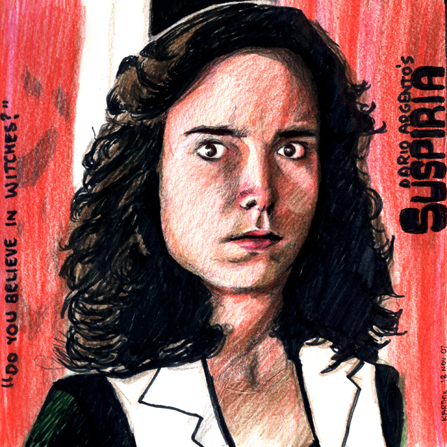
Oh, and I did a drawing to accompany this post too, which you can see above (click that image for a larger version). It's supposed to be Jessica Harper as Suzy from the film, though I don't quite believe the representation is that good. Anyway, it'll do. I wanted this one to be in colour (after all, with all the colour in the movie, I don't think a simple ballpoint pen sketch would do it justice), so used a selection of different tools to make the image — colour pencils, a black sketch pen and black ballpoint pen. The image you see above is pretty much straight from the scanner, it came out nicely with very little (almost negligible) post-processing.
A couple of additional points —- About the title Suspiria, though it is not explained in this movie, apparently it is the first in what is called Argento's "Mothers" trilogy, with each film being about one of three powerful witches whose goal is to spread evil. Markos in this movie is supposed to be "Mater Suspirium" which translates to something like the "Mother of Sighs". Argento's follow-up 1980 movie Inferno has the Mother of Darkness, and the third film (apparently scheduled for 2008) is itself called The Mother of Tears.
- About the drawing I did — while I am not too happy about the resemblance of the picture to the actress, I do like the drawing for the technique itself!
There are a few more movies in the queue for me to watch, I will try to watch one more and do a write-up/drawing combo of that, for today.
Southland Tales Drawing
One movie I'm waiting to watch is Donnie Darko writer/director Richard Kelly's second film, Southland Tales. The movie is going to be released in a few days' time in the US, and I hope I will be able to see it sometime soon too.
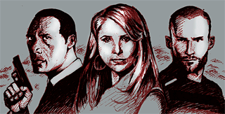
In my anticipation for the film, I did a drawing based on that today. Now this was done directly with one red and one black gel pen, and I wasn't too sure that it was good enough to add to the gallery, but I decided to go ahead anyway. I'm pretty happy with the way the faces came out, especially Sarah Michelle Gellar's — as I've tried drawing her a few times in the past and I believe this drawing captures her likeness the best. Click on the image above to view the drawing, and as usual, comments are welcome.
You've got Red on you...
I recently downloaded IDW Publishing's comic book adaptation of the movie Shaun of the Dead (from here), and read it on Friday. It was very well done. A short review follows.
Shaun of the Dead, of course, is the 2004 UK hit movie from the creative minds of director Edgar Wright and writer/star Simon Pegg, and is a fond tribute to zombie movies. On top of that, it is also a romantic comedy (hence, the term rom-zom-com)! The movie balances genres very well and excels at being a sweet romantic comedy (that just happens to take place in London where the dead are being mysteriously reanimated), and is also a very nicely done zombie movie, without ever coming across as a spoof just for the sake of it. With the strong writing, acting and energetic filmmaking on display here, it's no wonder the film was a critical as well as a commercial success (it is on the IMDB's Top 250 list). The story concerns 29-year-old Shaun (Pegg) who stays with his buddy Ed (Nick Frost), and works as a clerk in a department store, and is having problems in his relationship with his girlfriend Liz (Kate Ashfield). He wants to "do something with his life" and gets the chance to do just that, and save the day, when zombies start appearing all over town. The movie is a lot of fun and also has some very good gore effects.
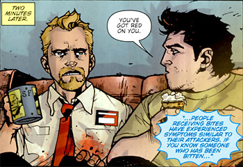
The 4-issue comic book adaptation of the movie has a script by Chris Ryall, and the artwork is by Zach Howard (some inking work is contributed by Sean Murphy), with colours by Thompson Knox. The issue covers are done by Jason Brashill. The comic is a very close adaptation of the movie. So, it is difficult to evaluate the story on its own, but I would say they did a very nice job of translating the story in this medium. I loved Zach Howard's artwork here. He captured the likenesses of the characters very well, while maintaining a distinct style of his own. The art is suitably cartoony when it needs to be, and creepy when portraying the zombies (very nice balance, just like the movie!). The colouring work contributes to the art effectively. A lot of my favourite bits from the movie were translated well, but obviously some of the gags work better in the movie than on paper (the yawn thing for example). Still, you have to admire the effort that was put in (it would have been easy to make this a rush job to tie in with the movie, but they obviously didn't do that). "If you... are thinking... of missing... this book, DON'T!"
The file from the download link above also comes with a scan of an 8-page story from 2000 AD magazine, called "There's Something About Mary" which details how one of the zombies shown early on in the movie became that way. I wonder whether there is a comic book adaptation of the Pegg/Wright follow-up Hot Fuzz (2007) too? "FASCIST! HAG!"
Teleport Destinations #5
Been meaning to make this post sometime back, well I guess now's as good a time as any. Nothing much, just a set of links to some interesting webpages I came across recently.
- A recent article on Slashdot talked about a guy who built his own "homebrew" CPU, called Magic-1. It has a processing speed of 4 MHz it seems, and it runs a customised version of Minix. As some the comments on the Slashdot article say, it's a very interesting read for any CS engineer. I found one thing very amusing — the creator says that he was not too happy with the performance of the OS on that CPU, so he implemented demand paging in the OS himself. Hmm, and here I was yesterday, proud that I coded an RSS feed for my site... The awesome thing about this CPU is that he implemented a web server on it too, and apparently you can communicate with the computer through telnet (though I haven't been able to do so, so far). Here are the relevant links: the Slashdot article, a summary article, and the Magic-1 homepage.
- I was talking about the game Portal in a previous post, hence I found this comic strip on Penny Arcade very amusing.
- Saul Williams' latest album, The Inevitable Rise and Liberation of Niggy Tardust! was released in a free-to-download form, like Radiohead's new album In Rainbows. I downloaded the former album, which has music by Nine Inch Nails' Trent Reznor, but haven't heard the full thing yet.
- Two recent downloads from The Manchester Morgue blog: the soundtrack for Attack of the Killer Tomatoes and the comic book adaptation of Shaun of the Dead. I read the Shaun book and it was great, will write a review for it soon.
- This one I came across recently on Doomworld, Derek MacDonald a.k.a. Afterglow recently wrote a lengthy post on his blog called Best Individual Add-On Doom Levels, and it was a very insightful read. It's a great selection of levels, and a very well-written article that provides lots of information about the levels, their authors, and what makes them special.
One more post is thought out and needs to be written: the review for the Shaun of the Dead book. Now I need to decide what drawing to do for today!
Feed me too!
Hey, Happy Diwali people!
It was a long weekend at work (yesterday holiday), and I was quite happy to have one! Contrary to what you'd expect, though, I spent time yesterday and today doing a bit of coding on my site, and have constructed an RSS feed for it, which I will talk about in this extremely lengthy post. Don't worry though, our regularly scheduled programming (movies, drawings, etc.) will continue soon...
I've wanted to add an RSS Feed to my site for a very long time. But it's only been the last couple of months that I'd been seriously planning for it and thinking of ways to implement it, and I finally completed it today. Look to the left of the screen, below the menu there is an icon with "RSS" next to it, and if you are viewing this site on a browser that is capable of recognising RSS feeds, you should see the feed icon on the address bar itself.
But hold on a moment, let me take some time to clearly explain what this is about, and how I implemented it. You'll have to forgive me if some of this is very basic stuff though (and some of you must forgive me if this is needlessly complex). Also, the way I've coded it is probably not the best way to do it. But it was something interesting to do, and I put in quite some time into it, so I thought why not write an article on it.
What is an RSS Feed and why should I care?
If you're like me and you regularly follow a number of websites/blogs, you probably keep visiting them frequently to see if the authors have updated the content there. But then, if the list of these websites is large, you'd probably like it better if you could get a "summarised" view of all the updates on this entire set of websites, like below —
That's a screenshot from Google Reader, which is an aggregator. An aggregator (or "feed reader") is a website or a software program that provides such summarised information pulled from websites. How does it know what information to pull from a website? That's where an RSS feed comes in. You see, a few years ago, a bunch of guys came up with a method for a site to provide a summary of updated content, in the form of a simple XML file. This specification is called RSS (Really Simple Syndication). The way it works is, a website generates a summary of updates as an XML file conforming to this specification, and then aggregators simply peek at this file and generate the summary you see above. Sites that provide a summary like this can have their content syndicated by other websites this way, so it becomes another channel to get the content out there.
Building the RSS Feed for Karthik82.com
So, now we've established that we need to have an XML file formatted in a particular way and made available to anyone (an aggregator/feed reader). What is the format required actually? Look no further than the RSS 2.0 Specification page. As you can make out, the file contains the following items —
- An opening header, identifying it as an XML document,
- a channel tag, which contains information about the website that is providing the feed, and
- a set of item elements, that contain the items that are part of the feed. Each item contains a title, a description (the actual content) and a link (which is a link to the actual content).
So, now, all we need to do is make sure that whenever an aggregator wants it, there is an XML file fomatted in the above way, with the relevant data, available. There are a few ways in which this can be done —
- Generate the XML file manually (that is, type it out in any text editor), each time an update is made to the site. Add the required data to the XML file and then upload it. This would work, but it's not really a good way of doing things. Plus, not all the content from my site can by syndicated this way. I wanted comments to also show up in the feed.
- Have a PHP script on the server that triggers the generation of the XML file, whenever it is called. This one is a step better than the previous method. Since it's a PHP script generating the XML file, it can have direct access to the database and pull out whatever content needs to be present in the feed. The problem is, the XML will be updated only when the script is executed, so it'll not necessarily be in sync with the content on the site.
- The third method is the one I finally went with: don't have an XML file on the server at all! Dynamically "feed" the XML content to the aggregator (through PHP, again) whenever it asks for it. The Wordpress blogging platform handles RSS this way.
Now that I'd decided how to generate the feed, the next step was to actually decide how to pull the relevant data from my database tables and make it available in the feed. I wanted to have a chronological view of activity on the site, which means that not only should blog posts figure in the feed, even drawings, movie reviews, and most importantly, comments, needed to be there as well. I thought of a few ways to accomplish this, as well —
- Pick up the top 15 (or whatever) rows from the blog posts' database table, step through it one row at a time, and generate the item information. This doesn't achieve the objective of representing all activity on the site (as it only concerns itself with the front-page blog posts), but it's the simplest thing to do.
- The ideal thing to do would be this — create a doubly linked list, where each node contains an item. Step through all the rows on all the relevant database tables on my site (comments, news posts, drawings, movie reviews, level reviews), and then put them all in the list. Then, sort the whole list chronologically. One of the fields in the item is anyway a date, which can be stored as a Unix timestamp, and this can be used as the key for sorting. Then, step through this list and pick up the top 15 or 20 (or whatever number) items from there, and dash it off as the XML. This would present (as I call it) a true chronological view of all activity on the site. But it is a bit complicated to do, and here's the most important thing, aggregators are going to be polling the feed regularly, so I was worried that this method would cause problems if it used up more memory. Alternately, I could do this on the database side, by creating a view that would contain the sorted data from the relevant tables. But I don't know whether that would make matters any better, and besides I'm far worse at coding SQL than I am at PHP, so I don't think I'd be able to pull that off. Bottom line: this is a bit too much.
- What I finally ended up doing was a compromise. I query the tables one by one. I pick up the top 10 rows from the news table, 5 rows from the drawings table, 5 from the comments, 5 from the level reviews, and 5 from the movie reviews. So that's thirty rows in all. From these, I pick up the relevant fields and put them all into an array (I actually started coding a doubly linked list, but Varun advised me to use an array instead. I'm glad I followed his advice, since, I realised that PHP's arrays are very powerful and not at all like the arrays I was used to in C). This is actually an array of objects (I defined a class called feedItem which would contain the relevant fields I needed in the RSS feed). I then perform a Bubble Sort on this array. Now out of all the sorting methods I was exposed to in Engineering, I always found Bubble Sort to be quite an intuitive one, that's why I went with it. Perhaps it's not the best method (then again, I don't think the performance will be too bad, because many of the elements in this array would already be sorted), but to be frank I didn't think too much about optimisation. My code is an implementation of the first algorithm given on the Wikipedia page (though I remember following the second one during Engineering). Once sorted, I simply output the XML (I output a header saying Content-Type: text/xml with PHP and then follow that with the XML content), and voila, the feed is ready!
Whew! So now, you can have something like this —
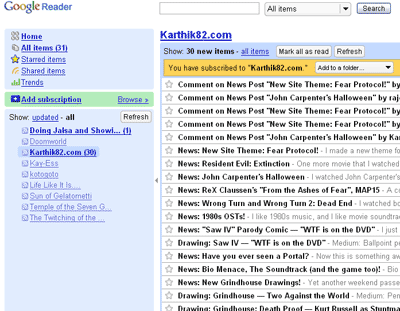
Yay! That's Google Reader with a subscription to my site's RSS feed! The URL to the feed on this site, by the way is http://karthik82.com/rss so you can add that into your aggregator. That's not all. There is one more cool thing I did with this. I added this RSS feed to my orkut profile as well. When you visit my profile, you'll see a link called Karthik82.com on the left side menu, and on clicking it, you'll see something similar to this (click for a larger image) —
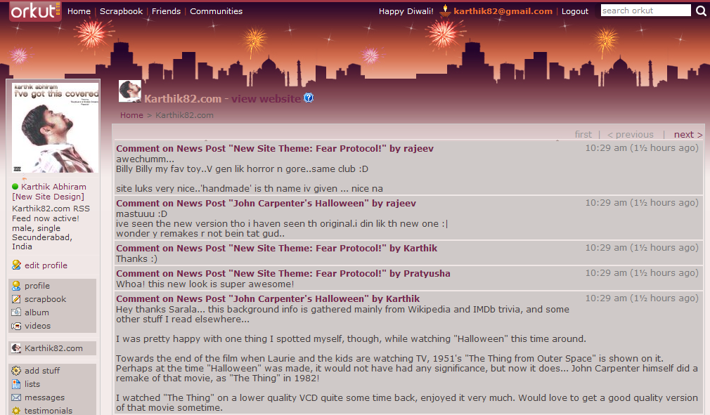
That's a summary of the updates on my site, accessible within orkut itself. You can add the feed link to any site or service that supports RSS syndication. A couple of people to credit: Krish Ashok, for the discussion we had the other day, he kind of confirmed that the direction I was heading in was the right one; Kartik Agaram for being a strong advocate of building an RSS feed; and Tobias Münch, for going ahead and building an RSS feed for his site, thereby inspiring me to do one myself (the headline, by the way, is a reference to this post on Toby's site, where he announced that he had created an RSS feed for it). I also picked up some info from these articles: this, this and this (the last one, by the way, is about the CDATA element in XML, which I used for the description field of every item, as the blog post content which is going to go into the XML file, has markup within it). Now I don't know how many people will actually use the RSS feed from my site, but hey, I learnt something while implementing this, and I can lay claim to building a completely customised RSS feed for my site. Feel free to give your comments below.
New Site Theme: Fear Protocol!
I made a new theme for the site today, and it now replaces "2006 The Reloaded" as the default appearance for the site. Which means, if you haven't explicitly chosen a visual scheme for this site, it should be looking quite different from when you last saw it! I call the new theme "Fear Protocol" and it uses drawings of mine as the logo and other graphic elements of the page design. This may not be as polished or elegant as the earlier design, but I'm going to retain it as it's way more interesting than the old one was. Also, I'm going to enjoy freaking out first time visitors to the site with this.
Of course, you can switch the appearance back to the old theme anytime you want, simply by going to the Customise link and selecting "2006 The Reloaded" as the theme. To view the new theme, select "Fear Protocol" from that page. If you haven't done it already, you might also want to check out the other two themes available.
With that out of the way, here is some "behind the scenes" stuff on this new design. First of all, I must credit IronicSans, as it was that site which inspired me to use drawn graphics as opposed to fonts for the logo and other elements. The logo banner, menu items and the icons for post categories were simply drawn out on one sheet of paper, scanned and then used for the graphics. I decided to use black, white, grey and red as the primary colours in this design, and so the drawings were done with black ballpoint pen, pencil and a red gel pen. With the exception of the "creepy guy" face at the extreme right of the logo header, all art was created newly for this design. Here is a combined image of the "Post Category" icons —
![]()
You can click on that to see a large image. A short description of each of the icons follows —
- Movies: Represented by a close-up of the Billy puppet from the Saw movies.
- Doom: One more extreme close-up, and this one is of the Spider Mastermind from the game.
- General: I was thinking about what to draw for this. Finally, I went with a movie character again, this is Brad Pitt as "Tyler Durden" from Fight Club. Apart from the fact that the movie is one of my all-time favourites, I used this picture as it contains nice red elements that go well with the overall scheme. This is based on a painting by Phil Noto.
- Art: The idea here was to have a drawing that was partially completed. I don't know whether the final icon conveys that effectively enough, but anyway it suffices I guess. The face here is Trent Reznor, frontman of the band Nine Inch Nails.
- Tech: This is not an often-used category for my posts, and it is also one of the tougher ones to choose an image for. I use this category to classify the more technically-inclined posts, so the image I used is one of the "Reverse Beartrap" from Saw. After all, it is a product of Engineering!
The notebook lines which are used as the page background were scanned off an actual notebook (a TCS notebook, one we got at work sometime back). The blue shading between some of the lines were actually at the bottom of the notebook page, I reversed that for the site, as having the blue on the top seemed to go better with the banner placement. Another interesting element is the Nasty Little Thing mascot peeking from the left of the logo! For the typeface I decided to go with normal Arial, falling back to Helvetica and then default sans-serif. This design is also wider than the previous ones, to accomodate the larger font size. So, a 1024 × 768 resolution is required for this, anything lower and you'll get scrollbars. I used to stick to designing for lower resolutions also, but I don't think those are that prevalent any more (last time I checked, under 4% of my visitors were using 800 × 600).
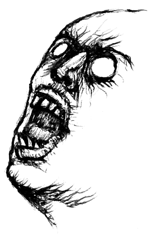
With all the other elements of this new design broken down, the only one left to talk about is the "Creepy Face" which you see above, and on the header to the right of the logo. You could actually call this one a doodle. It was done on 13 Jun 07. You see, it was Campus Recruitment season at TCS Chennai, and I had gone to support that at Coimbatore (we visited several colleges there, and the recruitment numbers were huge!). Anyway I was on one of the interviewing panels and I was keeping a list of the students we were interviewing (just to keep track of how many interviews our panel was doing). I drew that creepy face on that paper, in between interviews. I later showed it to my roommate Rajith, who was sufficiently creeped out by it.
Whoa, that turned into a long post! Well, do let me know what you think of this new design of mine. Like I said, until something better comes along, I am going to keep this as the default appearance of the site, as it is more "personal" than the standard stuff I've been doing all this while.
Resident Evil: Extinction
One more movie that I watched this evening was Resident Evil: Extinction. I have not played any of the games, but I like the movie versions. The first movie was nicely done and had a slick look courtesy director Paul Anderson. Anderson wrote the sequel Resident Evil: Apocalypse too, but did not return to direct. I watched that one in 2004, and I liked the movie, though it did not sport a polished look like its predecessor (blog post from Sep 2004 here). That one did set up some interesting story threads though, and hence, we now have a third entry in the series. This also was written by Anderson, though the directing duties have been taken over by Russell Mulcahy (Highlander).
It is a few years after the events of Apocalypse and the planet is now a wasteland, overrun by the T-virus infected undead. A small group of survivors, led by Claire Redfield (Ali Larter) and S.T.A.R.S. solider Carlos Olivera (Oded Fehr) have formed a convoy and have been moving from place to place over the last few months, gathering supplies and keeping alive. The series' heroine, Alice (Milla Jovovich) has stayed "off the grid", and has been generally leading a nomadic existence, until she finds a diary that indicates that there might be a safe place from the undead in Alaska. Soon, the characters' paths converge, and Alice meets Redfield and her convoy. The group decides they will try and make it to Alaska. But the Umbrella Corporation has other plans. The mad scientist character Dr Isaacs (Iain Glen) who was introduced in the second film, is continuing his experiments on the T-virus and is after Alice, and will do anything to get her dead or alive.

I really liked this movie, and felt it was superior to the second entry in the series. The scope of the film has been expanded — in the first film, the infection was contained in the Umbrella Corporation's underground facility, the Hive, whereas in the second film, the infection spread to the whole of Raccoon City. This movie presents us with an end-of-the-world/post-apocalyptic scenario (some elements here, like people searching for fuel and supplies in a barren wasteland are reminiscent of the genre classic Mad Max 2 a.k.a. The Road Warrior). Director Mulcahy also brings energetic, striking visuals to the film (highlights of the movie include a long sequence set in Las Vegas, with the characters fighting off hordes of zombies, and a sequence with crows which have been infected!). There is considerably more action, violence and gore in this movie than the previous entries (which is much appreciated), and the film also nicely carries forward the story threads established in the previous entries. It is also a much more polished film than Apocalypse was. Milla Jovovich once again makes a great heroine (on the other hand, though, Ali Larter's character Claire Redfield is underdeveloped — she participates in the action sequences and dispatches the zombies, but aside from the fact that she is the leader of the convoy, we aren't given much background on her).
This review of the movie would not be complete without mentioning the music score. The first movie had a memorable music score (contributed by Marco Beltrami and Marilyn Manson), which complemented the action quite nicely and added excitement to the proceedings. The second movie's music was done by Jeff Danna, and I guess it was adequate for the movie. But even after watching the movie more than once, I don't remember its music at all. That is rectified in this entry, because the filmmakers chose Charlie Clouser to be the composer. Clouser contributed the unforgettable music for the Saw movies, and here too, there's a memorable score which adds to the energy of the visuals, especially in the action scenes. Certain elements of the music remind you of Saw, but overall, this is a nice variant of the first movie's music.
The movie took some interesting turns in the third act, and had a satisfying ending (which effectively closes the story of Alice, but without totally removing the possibility of a further sequel). Once again, I have a drawing to go along with this post, which you can see above (click the picture for a larger version). This was also done with a black ballpoint pen and was done very quickly (in about 15-20 mins I think). I got to draw Milla Jovovich again, though, due to the short time spent, is not as good as my earlier attempt. What do you guys think about these drawings? Personally I think they're more interesting than simply putting up some random screenshot/still from the movie in question.
John Carpenter's Halloween
I watched John Carpenter's 1978 scare classic Halloween this afternoon. And I loved it! They'd shown this on STAR Movies long back (more than 10 years ago... it was the time I was writing my Class X SSC exams), and I remember it specifically because it one of the few movies they showed in letterboxed widescreen, preserving the 2.35:1 aspect ratio it was shot in. I had recorded it on videotape and watched later, but the sound wasn't proper and I also didn't watch it with full concentration, therefore, watching the movie now was like watching it for the first time.
Halloween starts off on Halloween night, 1963 in the town of Haddonfield, Illinois. A long point-of-view shot takes us from the outside of a house to inside it, and upstairs, where the murder of 18-year old Judith Myers (by stabbing) takes place. The POV continues till we are back outside the house, and the killer's mask is pulled off, to reveal that it was 6-year old Michael Myers who did it! Fifteen years later, Michael escapes from the Smith's Grove Sanitarium and returns to Haddonfield to kill again, and he has his sights set on three girls — Laurie (Jamie Lee Curtis), Lynda (P J Soles) and Annie (Nancy Loomis). Dr Sam Loomis (Donald Pleasence), Michael's psychiatrist pursues him and also arrives in Haddonfield. Michael is a silent, soulless killer, the embodiment of pure evil (the credits simply list him as "The Shape"), and with his Captain Kirk mask, has a truly frightening presence. What follows is an extremely well-done horror/thriller that deserves its status as a classic!
There are several reasons why the film is remarkable. There are only a few locations used (most of the film is set in one neighbourhood and it all happens in about three houses), and the bulk of the film happens on one night. I loved this minimalist approach they took for this movie, and Carpenter creates some very suspenseful stalk sequences (this film is credited for establishing the slasher genre).
The movie was made on a shoestring budget of $325,000 it seems, and made back about $47 million, which makes it one of the most successful independent films ever! Apparently, half of the budget went towards Panavision cameras so that Carpenter could shoot in 2.35:1 widescreen (heh, lucky thing that STAR Movies showed the widescreen version, eh?). One must appreciate how well they used the limited budget — the creativity and skill behind the camera make this movie effective (Michael Myers' Captain Kirk mask apparently cost about two dollars). It's been almost thirty years since the movie first came out, and it still has an impact today. Another remarkable fact is that for a film about a killer, there is very little on-screen violence and almost no blood!
One of the movie's strongest assets is the eerie music score, done by John Carpenter himself (the end credits list the music as being performed by "The Bowling Green Philharmonic Orchestra" which is just Carpenter). He has done the music for most of his movies and they're all very unique. They're mostly simplistic tunes but suit his films very well, and this one is no different.
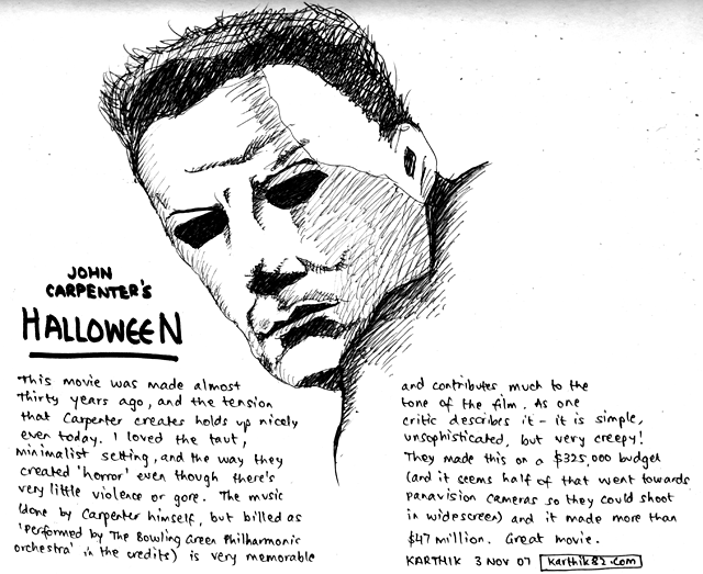
I was very inspired by the movie, so did a quick drawing of The Shape. This was done in about 10 minutes with a black ballpoint pen. You can click the image above, for a larger version. Oh, and here is a MIDI version [29 KB] of the Halloween theme music. The actual version is better of course, but this is pretty close. I downloaded this some years ago, don't remember where I got it from.
ReX Claussen's "From the Ashes of Fear", MAP15
A couple of days back I saw a post on Newdoom announcing that ReX Claussen's latest work, a three-map set for Doom II had been completed and released. It was called From the Ashes of Fear and I immediately downloaded it. Having played some of ReX's earlier work, I knew that this one would be a quality release, and I remembered reading updates and seeing screenshots from these levels on his site while he was building them.
Now I was actually planning to watch a movie tonight but somehow it became 2:30 AM which was too late to start a movie, so I thought I'd play some of Ashes instead. I just got through playing one of the maps in the set (MAP15) and it was simply awesome. So, thought I'd write some comments on this map before going off to sleep. If I miss anything now, I will edit this post from office tomorrow (heh, heh).
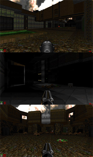
I played the map on Skill 1 for two reasons — one is cowardice, and second is because I wanted to walk around and admire the architecture without worrying about getting picked off by monsters. Turned out to be a good decision too, and it was a very well-spent twenty-five minutes! I was reminded of one of ReX's earlier maps from a few years ago (wicked_5 I believe it was), which was remarkable because he made you walk through the entire map without encountering any monsters, and once you reached the end, you flipped a switch which activated many doors and other rooms in the level, and also populated the map with enemies. This one wasn't like that map exactly, but I was reminded of it because MAP15 does involve quite a bit of revisiting areas which you've been in before. I loved the way ReX paced the map, the flow was entirely logical and whenever you returned to an area, he used it to stage an interesting fight. I had no problems with health/ammo while playing the map (but then this was skill 1, things would have been much tougher on the other skill levels, though I'm sure that things would have been balanced well). Gameplay was great, nothing else to say.
Above are a few screenshots I took while I was playing the level. It's a pretty big map and has lots of large, open areas and some dark, claustrophobic areas. I love the way he used lighting to create atmosphere (one of the screenshots above, for example), and the greyish tech-base look I would say is "typical" of ReX (rather, it's what I associate with his work, from whatever levels of his I've played). It's a very beautiful looking map, and I liked the use of symmetry both in appearance as well as layout. At the end of it all, it was a solid map, and I'd even go so far as to give it a 10/10 rating. Great work!
That's not all though — this level set is constructed to mimic Doom II's secret level placement, in the sense that there's an alternate exit in MAP15 leading to MAP31. When I reached the end of MAP15, I was about to walk in to the exit, when I noticed the alternate exit just next to the normal one. Only, it was blocked off, so that made me want to go back and find out how to unlock it. That's something I will probably do over the weekend. This map set also comes with a good amount of "DVD extras" including a text file that gives you hints on the secrets, so that will come in useful, also, I will probably just play the other two levels here starting from scratch.
Nothing more to say, got to go and sleep now. Tomorrow is Friday, which means I will go into "weekend mode" from the morning itself and will try to leave office early.


Dark Fate 2 is a singleplayer level for Doom II, replacing MAP01. It's a small-sized hellish level — and there's a walkthrough video as well.


27-year old Taurean (birthday 15-May-82), Assistant Manager - HR at Tata Consultancy Services Ltd in Hyderabad, India. Previously, did Post Graduate Diploma in Management from T A Pai Management Institute (2003-05) and before that, Computer Science Engineering from Sree Nidhi Institute of Science and Technology (1999-2003).
Email: karthik82 -AT- gmail -DOT- com
orkut profile
Facebook profile
YouTube channel
deviantART page
Google Reader Shared Items
Disclaimer: The views expressed on this site are purely my own.
Warning: This site occasionally contains profanity.

Powered by PHP, Apache and MySQL. Web stats by StatCounter. Hosted by Answerable. Layout is inspired by Derek Punsalan's Grid Focus theme.
I wrote all the code here, and it should be Valid XHTML 1.0 Transitional.
[ Tyler | The first rule of Fight Club is you do not talk about Fight Club ]