Windows Fonts under Linux!
Some days ago, I was browsing Synaptic Package Manager for some free fonts to install on my Ubuntu Linux system. The default ones that are installed with the OS and with OpenOffice.org are good. But I thought of getting some more as well. Imagine my surprise, when I saw a package entitled msttcorefonts, which allows one to install the Microsoft Core Fonts for the Web, under Linux!
Back in 1996 it seems, Microsoft started a project to develop a set of standard fonts designed for use on the web. Looks like they were successful too. After all, how many websites do you find which stray far from using Arial, Verdana, Trebuchet MS and Georgia as their typefaces? Most designers use these fonts under the assumption that they'll be available on most systems. It's all well and good on Windows, but these fonts aren't available by default on all operating systems.
When I installed Ubuntu on my computer, initially, webpages were displayed in the default font selected on Firefox. Later on, I set the preferences to make the fonts closer to what I liked. I set the default sans-serif font to FreeSans, which could be thought of as an alternative to Arial (actually, it is more similar to Helvetica, which is in my opinion, a more elegant font than Arial). This way, many webpages looked similar to what their designers intended, but not all. But that changed, when I saw the msttcorefonts package and installed it.
Installing the Microsoft Core Fonts for the Web under Ubuntu
This is very simple. All you have to do is to open your Synaptic Package Manager, and search for msttcorefonts. Select that package, and it will also prompt you to install something called cabextract. Select this, and choose "Apply Changes", and sit back and wait a while.
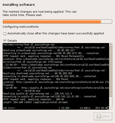
Though these fonts are free, Ubuntu's license prevents them being freely distributed with the OS itself. msttcorefonts is somewhat like a dummy installer, essentially, it downloads each font from a repository. These are distributed as EXE files which internally contain CAB (Microsoft Cabinet) files. Using cabextract these fonts are extracted and installed on your system. Of course, this is all done automatically and once completed, you'll have an extended set of fonts on your system. This includes all your old friends, like Arial, Times New Roman, Trebuchet MS, Verdana, Georgia, Impact and even the often-ridiculed Comic Sans MS.
A few examples
Below are a few examples on how things change, after installing these fonts. First up, an example for my site itself. Peek at this picture —
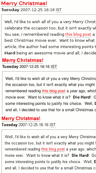
That's three versions of text on the main page. At the top, you have the text rendered in DejaVu Sans, the default sans-serif font on Firefox. Next, the text is rendered in FreeSans (I had customised my preferences to that). The last bit shows the text in Arial.
Next example is my brother Varun's website. Now, this being a portfolio site and the fact that Varun is quite particular about aesthetics, the typeface is something essential to the overall look of the site. He uses Trebuchet MS as the main font on the site.
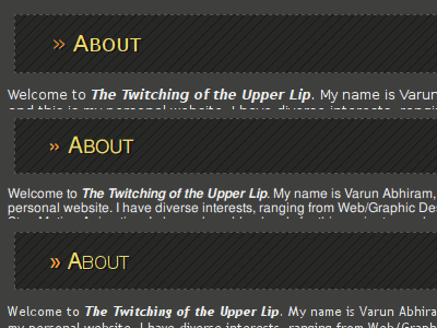
On top is the DejaVu Sans version, then the FreeSans version and finally, the way it was intended to render, in Trebuchet MS. (Note: Look at the text not the heading "About".)

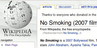
Above is orkut, with the text rendered in Verdana, as intended. However, not all sites are designed with Arial or Verdana in mind. Two sites I frequent, which didn't considerably change their appearance even after installing the MS fonts, are Wikipedia and Slashdot. On these two sites, the text is rendered in the default sans-serif typeface, as per your browser's setting, and that is Arial on most Windows systems. It's FreeSans on mine, so here's what those two sites look like —

Personally, I like the way they look, as it's refreshing to see FreeSans as opposed to Arial every now and then. I also wanted to try and experiment with these fonts on Office documents. So, I opened up OpenOffice.org and created a document, using these fonts. I mailed that to Varun and then opened it on Microsoft Word on his computer, and took a screenshot. See the comparison below —
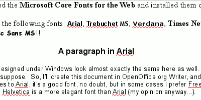
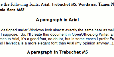
Top one is the document in OpenOffice.org, and bottom one is in Microsoft Word. You can also install other TrueType fonts on Linux. So, you could simply copy fonts from a Windows system (say, the "C" fonts of Windows Vista — Calibri, Cambria, Constantia, Corbel, and the like) and install them on Linux, and enjoy the expanded font set. Obviously, the way they render would be still slightly different on Linux than Windows, depending on the font smoothing method used. On my Ubuntu install there are four ways of rendering fonts, and I have set it to the Subpixel smoothing method. On Windows I used to have ClearType turned on. Anyway, by doing all this, most webpages look very similar to the way they would look on a Windows system.
Comments for this News Post
I put things offf a lot and don't manage to get anything done.
therefore that thing is maintained over here.
at this website, thanks admin of this website.
more than just your articles? I mean, what you say is
important and all. However think of if you added some great images or
videos to give your posts more, "pop"! Your content is excellent but with images and clips,
this blog could definitely be one of the very best in its niche.
Great blog!
to be shared around the internet. Shame on the search engines
for not positioning this submit higher! Come on over and
talk over with my website . Thanks =)
for the reason that i want enjoyment, since this this website conations truly nice funny data too.
and was wondering what all is needed to get set up?
I'm assuming having a blog like yours would cost a pretty penny?
I'm not very web savvy so I'm not 100% positive.
Any suggestions or advice would be greatly appreciated.
Kudos
approximately this, like you wrote the e book in it or something.
I think that you can do with some percent to power tthe message home a little bit, but instead of that, this is magnificent blog.
A great read. I'll definitely be back.
I had a quick question that I'd like to ask if you don't mind.
I was curious to know how you center yourself and
clear your thoughts prior to writing. I've had a hard
time clearing my thoughts in getting my thoughts out there.
I do take pleasure in writing but it just seems like the first 10 to 15 minutes are wasted simply just trying to figure out how to begin. Any recommendations or tips?
Cheers!
same page layout and design. Excellent choice of colors!


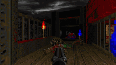
Dark Fate 2 is a singleplayer level for Doom II, replacing MAP01. It's a small-sized hellish level — and there's a walkthrough video as well.


27-year old Taurean (birthday 15-May-82), Assistant Manager - HR at Tata Consultancy Services Ltd in Hyderabad, India. Previously, did Post Graduate Diploma in Management from T A Pai Management Institute (2003-05) and before that, Computer Science Engineering from Sree Nidhi Institute of Science and Technology (1999-2003).
Email: karthik82 -AT- gmail -DOT- com
orkut profile
Facebook profile
YouTube channel
deviantART page
Google Reader Shared Items
Disclaimer: The views expressed on this site are purely my own.
Warning: This site occasionally contains profanity.

Powered by PHP, Apache and MySQL. Web stats by StatCounter. Hosted by Answerable. Layout is inspired by Derek Punsalan's Grid Focus theme.
I wrote all the code here, and it should be Valid XHTML 1.0 Transitional.
[ Jigsaw | Oh yes, there will be blood ]