Sherlock Holmes
I did this drawing of Robert Downey Jr from the Guy Ritchie movie Sherlock Holmes sometime back. It was done with a 6B pencil and then touched up in Photoshop —
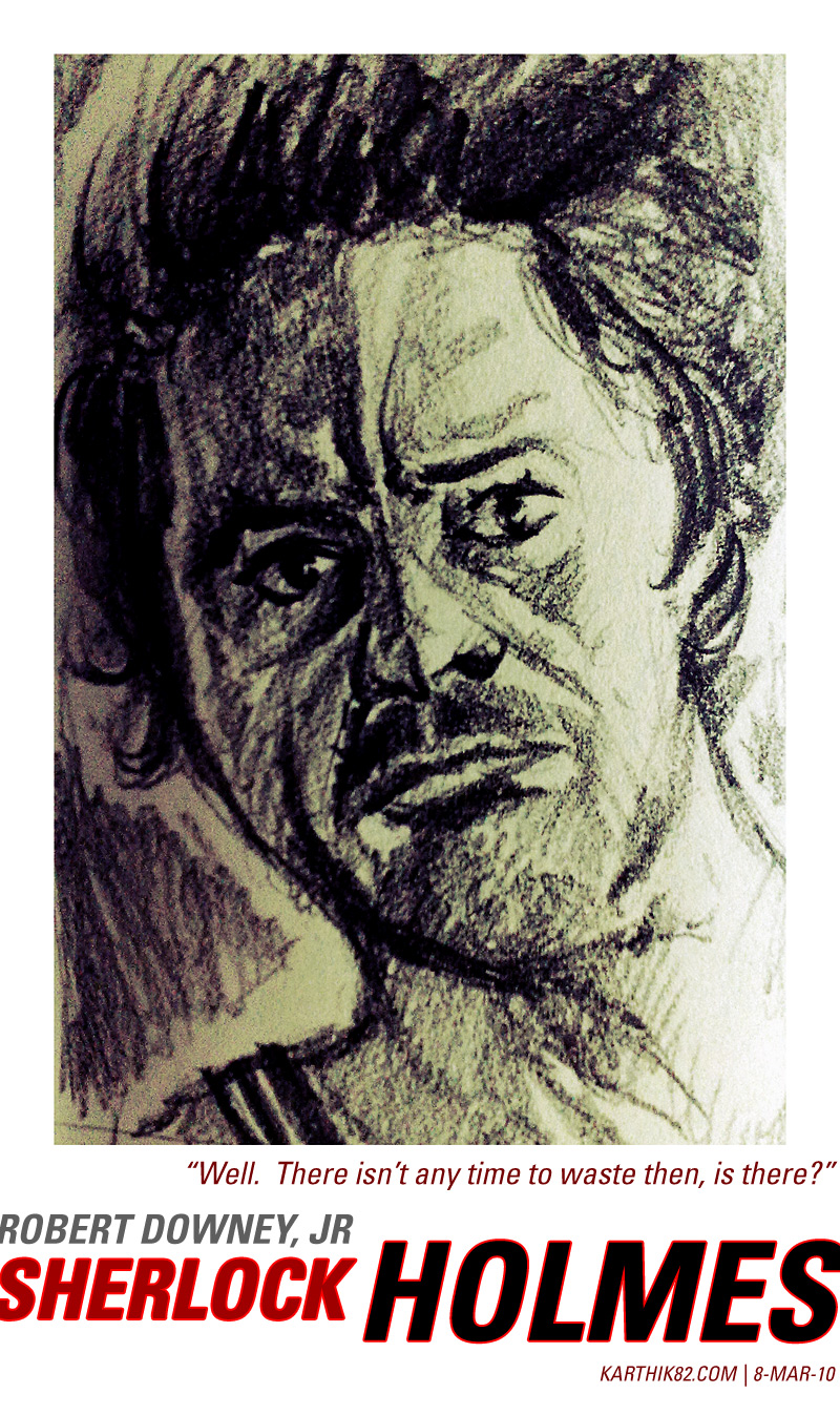
The drawing was done quite quickly. It was actually intended to be part of a series of drawings based on movies I'd seen recently, but this was the only one I completed. I tried to do something different with the typography this time. The text is in Univers Bold Condensed Oblique, which being from 1957 is a more modern typeface than appropriate for Sherlock Holmes, a late 19th century character. But it looked good, so I went with it!
What about the movie itself? I got to see it in a theatre, but in a rather uncomfortable seat (corner seat in the first row from the screen), but still enjoyed the movie a lot. I was initially skeptical of how the movie would turn out, since Guy Ritchie was an unconventional choice of director, Robert Downey Jr was an unconventional choice to portray Holmes (but I thought Jude Law as Watson was inspired casting) and the trailers made the movie seem like an action-packed adventure almost bordering on a parody of the character. Surprisingly, the movie was a balanced take on the character, providing the necessary action while still remaining true (at least in my opinion) to the spirit of the character. I say this having only a limited exposure to the actual character — I studied The Hound of the Baskervilles for two years in school (Class IX for "Special English"and Class X for English) and also have read a few of the short stories. I thought the movie captured the characters quite accurately, albeit a younger version of them.
The movie opens with Holmes and Watson apprehending the villain Lord Blackwood (Mark Strong), who before being executed, warns Holmes that he will rise again, and that there will be more murders. And true to his word, Blackwood's body disappears from his tomb, and people start dying. It is up to Holmes and Watson to figure out how to stop Blackwood. The movie had some nice twists. The themes of whether the goings-on are supernatural or have a rational or scientific explanation actually made me think of Tim Burton's Sleepy Hollow (which was also set at the end of a century, where the future promised to bring new technology).
The movie was nicely photographed (Philippe Rousselot) and I loved the music by Hans Zimmer ("Discombobulate" from the soundtrack is an awesome track). The song "The Rocky Road to Dublin" by The Dubliners appears during the boxing scene in this movie and I have become a big fan of it. It is probably Guy Ritchie's most mainstream movie. The end credits design is by Danny Yount and Prologue Films (who did the opening animation for Ritchie's previous RockNRolla. Check out this great article: Sherlock Holmes End Credits Sequence, Danny Yount Interview. Well, that's all I have to say about the movie now, maybe I will think of some more things once I watch it again!
Oh, before I forget, here is a video of me doing the drawing seen above —
The typeface used in the video is Akzidenz-Grotesk, which being from 1898 is only slightly anachronistic!
Comments for this News Post
After your review, may be I will.
I am Pratyusha - a friend of Varun's. I'm interested in drawing too and have recently started a lil' club. Do check out the blog and please let me know if you are interested.
Happy drawing!
Cheers!
It will always be useful to read through content from other writers and practice something from other
websites.


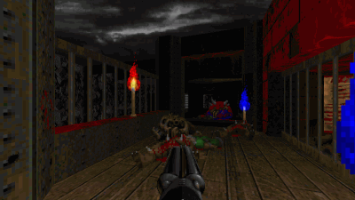
Dark Fate 2 is a singleplayer level for Doom II, replacing MAP01. It's a small-sized hellish level — and there's a walkthrough video as well.


27-year old Taurean (birthday 15-May-82), Assistant Manager - HR at Tata Consultancy Services Ltd in Hyderabad, India. Previously, did Post Graduate Diploma in Management from T A Pai Management Institute (2003-05) and before that, Computer Science Engineering from Sree Nidhi Institute of Science and Technology (1999-2003).
Email: karthik82 -AT- gmail -DOT- com
orkut profile
Facebook profile
YouTube channel
deviantART page
Google Reader Shared Items
Disclaimer: The views expressed on this site are purely my own.
Warning: This site occasionally contains profanity.

Powered by PHP, Apache and MySQL. Web stats by StatCounter. Hosted by Answerable. Layout is inspired by Derek Punsalan's Grid Focus theme.
I wrote all the code here, and it should be Valid XHTML 1.0 Transitional.
[ Flynn | I've had it with these motherfucking snakes on this motherfucking plane! ]